art direction, design + typography
Blog: July 2011
Should I work for free?

I think every studio and freelance designer should have a copy on the wall by the phone. It's not only a lovely 5-colour letterpress print but very sound advice to boot!
See the full version here and purchase the print here.
Copyright Jessica Hische.
https%3A%2F%2Fwww.deliciousindustries.com%2Fshould-i-work-for-free
Delicious+Industries%3A+Should+I+work+for+free%3F
Revolutionary Film Posters


The exhibition comprises of 95 posters including works from Alexander Rodchenko, 'The Stenberg Brothers' (Georgii & Vladimir) and Alexander Naumov. Many of which are the only known surviving examples and have never before been publicly exhibited.
"Reacting to the chaos of the Russian Revolution, the Constructivists sought order and felt it their civic duty to engineer a more stable and harmonious society."
I love the bold colours and dynamic compositions. It's such a shame I've only just found out about it. Don't worry though if you missed it too, all the posters along with photos of the exhibition can be seen here.
Images taken from Tony Shafrazi Gallery.
Via MUBI.
https%3A%2F%2Fwww.deliciousindustries.com%2Frevolutionary-film-posters
Delicious+Industries%3A+Revolutionary+Film+Posters
More Racing Numbers


https%3A%2F%2Fwww.deliciousindustries.com%2Fmore-racing-numbers
Delicious+Industries%3A+More+Racing+Numbers
F & F: Flowers and Fleurons

John has a passion for typography and letterpress. His home is shared with two letterpress machines; 1906 Harrild platen and a vintage 1965 Vandercook, as well as trays of vintage wood and metal type all used to create limited edition prints.
He's known in the industry for producing large scale prints, the most popular of which are his shipping forecasts, the first of which, 'Sailing By' was selected for the New North Press, Reverting to Type exhibition in London, 2010 (Mini versions are available here).
I met John at the AT Open House during the Brighton Festival and he kindly gave me one of his magnificent business cards - surely this is the longest business card on record!


https%3A%2F%2Fwww.deliciousindustries.com%2Ff-f-flowers-and-fleurons
Delicious+Industries%3A+F+%26amp%3B+F%3A+Flowers+and+Fleurons
From the reference box # 112


#112 - Vintage 'The Young Artist' Watercolours. I picked this little beauty up on a boot sale for a bargain 20p and even though I only bought if for the lovely box, it has a full set of watercolours still inside - shame I can't paint!
The packaging and colour palate screams 1950's (1957 it seems) and I love the paintbrush graphic. All-in-all a very well spent 20p.
See more fabulous vintage packaging and ephemera in our reference box.
https%3A%2F%2Fwww.deliciousindustries.com%2Ffrom-the-reference-box-112
Delicious+Industries%3A+From+the+reference+box+%23+112
Vintage bread wrappers


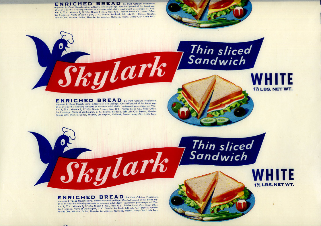


Bread used to be packaged in a waxed paper and sealed at either end with a sticker (in fact in the UK some brands still use the waxed paper, but heat sealed with a glue at the ends instead of with stickers).
These fine examples are waxed, bread wrappers from the 40's & 50's. I think the Victory Vitality Bread is my favourite because if it's simplicity, although the Skylark is giving it a run for it's money (it's that little chef hat on the skylark graphic!).
Se more of the collection here.
Via the How to be a Retronaut.
https%3A%2F%2Fwww.deliciousindustries.com%2Fvintage-bread-wrappers
Delicious+Industries%3A+Vintage+bread+wrappers
Auto Type XV


See the full collection here.
https%3A%2F%2Fwww.deliciousindustries.com%2Fauto-type-xv
Delicious+Industries%3A+Auto+Type+XV
A room full of letters


I need this much old signage in my life - where do they get it all from?
Actually it's best for my home and my bank balance that I don't know!
Actually it's best for my home and my bank balance that I don't know!
Via ffffound.
Originally from Graphic-Exchange.
https%3A%2F%2Fwww.deliciousindustries.com%2Fa-room-full-of-letters
Delicious+Industries%3A+A+room+full+of+letters
Auto Type XIIII


These are only half the auto type pics I took in one day - more to come later in the week!
View our full collection here and if you're a bit of a petrol head on the quiet, check out the beauties over on Super Ninety.
https%3A%2F%2Fwww.deliciousindustries.com%2Fauto-type-xiiii
Delicious+Industries%3A+Auto+Type+XIIII
Store Front: The Disappearing Face of Old New York


I love these pics over on How to be a Retronaut. They're taken from Store Front: The Disappearing Face of Old New York by James and Karla Murray, the result of years of photographing and "faithfully documenting the generations-old stores and shop windows of New York's neighbourhoods".
When it was published in 2009 the Murray's estimated that a third of the stores photographed had already closed, so I wonder how many are still open now, or even still standing? It's sad to think of those beautiful old signs being torn down as they add such character to a street, so much nicer than the bland plastic signage we see so much of today.
It's not just in New York either, it's the same story in every city - regeneration, redevelopment it's a never-ending cycle and I know it boosts the local economies, creates jobs and is good for the community, but I like the faded glory.
Two of my favourite places are Manchester and Blackpool, UK - purely for the charm and character of the old buildings and abandoned signage hidden in the back streets.
All images taken from Store Front:The Disappearing Face of Old New York. Copyright James & Karla Murray.
Published by Gingko Press.
https%3A%2F%2Fwww.deliciousindustries.com%2Fstore-front-the-disappearing-face-of-old-new-york
Delicious+Industries%3A+Store+Front%3A+The+Disappearing+Face+of+Old+New+York
From the reference box # 111


I've already posted about the lime drink and orange drink labels I bought as part of a collection, so here are the lemon ones; C&C (Cantrell & Cochrane) Lemonade, 'new' Kia-Ora Low calorie Lemon Drink and Sunparlor Lemonade with 'New turn off cap!'.
There's something about the print quality and design on these labels that really appeals to me. Sunparlor is my favourite of this bunch - I Just love the slightly off set startburst and the weird centred, but to the right contents info.
https%3A%2F%2Fwww.deliciousindustries.com%2Ffrom-the-reference-box-111
Delicious+Industries%3A+From+the+reference+box+%23+111
More Country Fair covers


Remember our post about Country Fair: The monthly journal of the open air? Well we've just uploaded lots more of the gorgeously illustrated 50's & 60's covers to Flickr.
As it's July 1st, the covers above are from July issues only, but you can see the full collection here.
If you like these it's quite likely you'll like these and these!
https%3A%2F%2Fwww.deliciousindustries.com%2Fmore-country-fair-covers
Delicious+Industries%3A+More+Country+Fair+covers
Welcome

Welcome to the Delicious Industries blog. We're an independent design studio based in Brighton, UK and this is our scrapbook packed full of design, illustration, photography & typography inspiration. Check out our work here.
Links
DELICIOUS FRIENDS
DELICIOUS FAVOURITES
- 50 Watts
- Acejet 170
- Grain Edit
- It's Nice That
- National Geographic Found
- Notcot
- Pretty Clever
- Retronaut
- So Much Pileup
- We Love Typography
- Another Mag