art direction, design + typography
Blog: October 2010
Citroen Ephemera


Really loving these 60's Citroen promotional booklets designed by Parisian studio, Delpire over on Grain Edit. They were created by the father of Francois-Charles (iconomaque) who worked at the studio in the 60's and were discovered whilst he was sorting through his father's studio.
What a great bit of ephemera to start the day with!
Via Sell! Sell!
Images copyright iconomaque.
https%3A%2F%2Fwww.deliciousindustries.com%2Fcitroen-ephemera
Delicious+Industries%3A+Citroen+Ephemera
From the reference box #91


#91 - Vintage fasteners. I love these 50's Snap Fastener and Hooks & Eyes cards from "World Famed", Newey's - "If it fastens Newey's make it!".
They're only small cards, but they have some great type...

and some lovely print...

Think I feel another collection coming on!
There are 90 more wonderful items tucked away in our reference box - take a look here.
https%3A%2F%2Fwww.deliciousindustries.com%2Ffrom-the-reference-box-91
Delicious+Industries%3A+From+the+reference+box+%2391
Christie's Travel and Vintage Poster Auction


Olivetti Divisumma (above top) by Herbert Bayer (1953) is lot number 252. It's a linen-backed, lithographic print (71 x 51cm) classed as A- condition with an estimation of £1000-£1500.
Olivetti Elettrosumma 22 (above bottom) by Giovanni Pintori is lot number 255. This lithographic print (70 x 49 cm) printed by Arti Grafiche M & G Pirovano in 1956 is not backed, but is classed as A condition and has an estimation of £600-£800.
Find more sale information here. Happy bidding!
Images copyright Christie's.
Via Quad Royal.
https%3A%2F%2Fwww.deliciousindustries.com%2Fchristies-travel-and-vintage-poster-auction
Delicious+Industries%3A+Christie%26%23039%3Bs+Travel+and+Vintage+Poster+Auction
From the reference box #90


#90 - Vintage throat lozenges circa 1950. I bought a few of these packages at a boot sale recently and have since found out a bit about the companies. Bradosol Antiseptic Lozenges are still available today, but these sample packs (above) are from when they were first introduced to the market in the early 50's by CIBA Laboratories, Horsham, England.
CIBA (Company for Chemistry Industry Basel or Gesellschaft für Chemische Industrie Basel) was a Swiss company started in the 1800's that first opened factories in the UK in 1911. It merged with Geigy in 1970 to create Ciba-Geigy Ltd and in 1996 they merged with Sandoz to form the pharmaceutical giant we know today as Novartis.
Here's an information booklet selling Bradosol, "to the Dental Profession".


I also found a sample/specimen pack of Collozets mouth and throat lozenges (below), "Manufactured in England by The Crookes Laboratories Limited, Park Royal, London".


I can't find out anything about Crookes Laboratories, but I did find this advert for Collozets from the late 50's...

If you want to see more delicious packaging and ephemera have a root around here.
https%3A%2F%2Fwww.deliciousindustries.com%2Ffrom-the-reference-box-90
Delicious+Industries%3A+From+the+reference+box+%2390
Preston Bus Station by Jonathan Kenyon


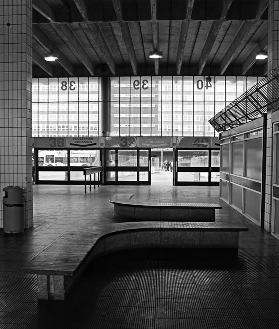
I was saddened earlier in the year to hear it's going to be knocked down as part of Preston's Tithebarn scheme (yet another urban regeneration programme) after it's application to become a listed building failed. It was designed in the late 60's by a Preston-based architect, Keith Ingham who worked at a local company, BDP (ironically the company now running the regeneration programme!) and when it first opened in 1969 it was hailed as the largest in the world.
There's no denying that the building could do with a bit of tlc, but Jonathan's images really capture the beauty of the building even in it's current state. Long live Preston Bus Station!
Images copyright Jonathan Kenyon.
Via Notcot.
https%3A%2F%2Fwww.deliciousindustries.com%2Fpreston-bus-station-by-jonathan-kenyon
Delicious+Industries%3A+Preston+Bus+Station+by+Jonathan+Kenyon
Chocolate Week


No, I haven't made it up. This week is National Chocolate Week (11-17 October), "a time of pure indulgence involving the country's best chocolatiers and chocolate shops holding events all over the UK".
So to celebrate I thought I'd share with you my best chocolatey find - chocolate type (above) from The Letteroom made using original Dutch moulds. These delicious looking letters are 17cm high and weigh in at 200 grams each. Now that's a lot of chocolate!
Each letter is available in either white, milk, dark or strawberry flavoured chocolate and can be personalised with wording or a pattern. They also sell mini (4cm high) letters for the less greedy!
Images copyright The Letteroom.
https%3A%2F%2Fwww.deliciousindustries.com%2Fchocolate-week
Delicious+Industries%3A+Chocolate+Week
Vintage coffee tins


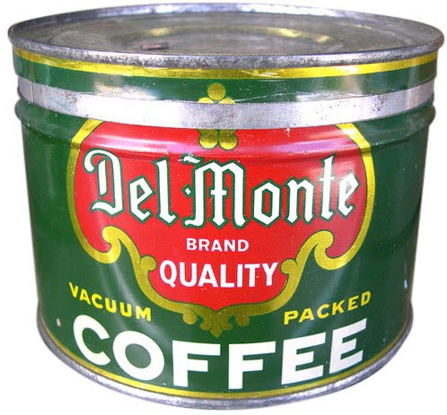

I love these 40's and 50's coffee tins from Roadsidepictures' (US photographer, Allen) collection of vintage packaging and advertising on Flickr. There's so much to look at, this is definitely one of those sets you need a lot of time and a cuppa to really enjoy.
Allen says he's always enjoyed, "photographing old neon signs, cars, motels, gas stations, roadside attractions and suburban life" - all of which can be seen in his Flickr sets.
See more vintage packaging here, here and here or have a rumage through our reference box here.
Images copyright Allen at Roadsidepictures.
Via Notcot.
https%3A%2F%2Fwww.deliciousindustries.com%2Fvintage-coffee-tins
Delicious+Industries%3A+Vintage+coffee+tins
SR692: Swissair - The Ultimate Fansite


I can't get enough of all the wonderful Swissair design and print on SR692: Swissair - The Ultimate Fansite. They have a massive collection of Swissair printed ephemera including posters, tickets, calenders, publications, postcards, annual reports, time tables and route maps, as well as a very informative history of the brand and logo.
Above are a selection of the more graphic route map and time table covers. They're all really fantastic, but my favourites are the ones using the Reudi Bircher designed plane graphic logo of the 50's and 60's.
Huge thanks to Darren for sending me a link to Wanken, which led me to this great site.
Images copyright SR692.
https%3A%2F%2Fwww.deliciousindustries.com%2Fsr692-swissair-the-ultimate-fansite
Delicious+Industries%3A+SR692%3A+Swissair+-+The+Ultimate+Fansite
Patrick Hruby


He's just completed this great ABC book for Ammo too...


Via Ffffound.
https%3A%2F%2Fwww.deliciousindustries.com%2Fpatrick-hruby
Delicious+Industries%3A+Patrick+Hruby
SurfLand


These gorgeous surf photos I found over on Me Design Mag are from a series called, 'SurfLand' by photographer Joni Sternbach.
"My pictures over recent years engage traditions of landscape, seascape, and architectural photography."
"I have concentrated on locations that are close to or directly on the water. At this juncture between land and sea, I explore subject matter in a constant state of transition.
For the last year I have been drawn to the people present at these locations, specifically the surfers in Montauk's Ditch Plains, at the eastern end of Long Island."
When I originally saw the top one I thought it was a vintage print - it reminded me of John Severson's surf pics from the 60's, so I was surprised when I realised they're modern prints but taken on a large format camera and produced using the classic tintype process (wet-plate collodion) which gives this lovely nostalgic feel.
Check out more of Joni's work here, and see more fabulous surf photography here, here and here.
All images copyright Joni Sternbach.
Via NOTCOT.
https%3A%2F%2Fwww.deliciousindustries.com%2Fsurfland
Delicious+Industries%3A+SurfLand
Welcome

Welcome to the Delicious Industries blog. We're an independent design studio based in Brighton, UK and this is our scrapbook packed full of design, illustration, photography & typography inspiration. Check out our work here.
Links
DELICIOUS FRIENDS
DELICIOUS FAVOURITES
- 50 Watts
- Acejet 170
- Grain Edit
- It's Nice That
- National Geographic Found
- Notcot
- Pretty Clever
- Retronaut
- So Much Pileup
- We Love Typography
- Another Mag