Q&A with Mike Daines
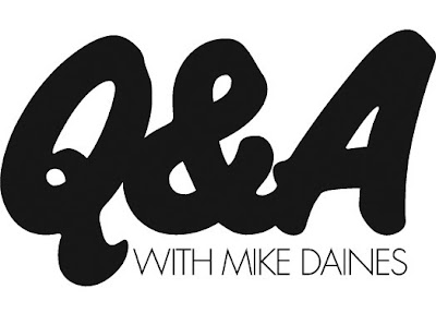
For the second of our Q&A posts, we have the delight in introducing Mike Daines, internationally known typographic communicator.
Mike has had an award-winning career in design and typography, which started in the early 70’s when he graduated for the London School of Printing and began work at the London Letraset studios. Whilst at Letraset he designed many typefaces, including Hawthorn and University Roman, as well as creating baseline magazine.
baseline was first published in 1979 by Letraset as their house typographic journal – a vehicle to showcase their typefaces to typesetting manufacturers and therefore only published when new material was available (which for the first 10 years was about one per year).
Mike designed and edited the first issue and edited subsequent issues overseeing contributions from guest designers and typographers including Banks & Miles (who designed the first colour issue - no.8 in 1986), Milton Glaser and Eric Spiekermann who edited and designed issues 6 and 7. Mike remained at baseline until 2007, after being co-owner and co-editor with Hans Dieter Reichert since 1995.
It’s through his involvement in baseline that I knew of him. baseline was one of those publications that as a student I couldn’t afford and used to spend ages in the college library or WH Smiths reading it. So when Mike got in touch, I couldn’t wait to ask him a couple of questions:
Is there one issue of Baseline that stands out for you as a favourite, either for content, design, the typeface or for the people you worked with?
I have a few favourites, but forced to choose, I’d settle for issue 20, because of the contents. The late Alan Fletcher gave us one of his tip-offs, about a rare collection of artworks by E McKnight Kauffer, hidden under a bed in Ladbroke Grove (it’s a long story, told in the magazine). I am a big fan of Kauffer, since college days, and we published some wonderful rare images. Plus early showings of the work of the now very famous Stefan Sagmeister; brilliant photos of disappearing Spanish signs by John Chippindale, and on and on….

What inspired the design for the very first issue of Baseline?
The brief was for a very ‘European’ look, seeing Herb Lubalin’s U&lc magazine as a direct competitor. Hence A4 as the first format, two colours, and a deliberately ‘cool’ typography – Futura, thin rules and lots of white space. Later it became big, full-colour and more vigorous, of course.
How do you think computer technology has affected design and typography over the years, and do you think it has had a positive effect?
How long have you got? Like other typographers of my generation I applaud the advances in technology (and currently work mainly with e-documents), while regretting the loss of some of the ‘filters’ imposed by the old structures; attention to type selection and letterspacing, for example. This can be countered by education, (and designers involving themselves in template creation), but carelessly fitting type into text boxes doesn’t constitute typographic design.
In your view, how might design/typography publications need to change in the future to stay ahead of the game, and ahead of the blogs?
There will always be a primary place for printed documents, and not just as objects, but the key thing is that form should follow function – instant communication in e-documents; moving images in interactive media and e-zines and so on. The key remains clear communication through good design…
and lastly…
What was the last typeface you used and for what purpose?
I am currently working with Rotis (Semisans) in various weights, in a series of publications (and e-publications) for a London firm of stockbrokers. Otl Aicher’s Rotis family broke some new ground, and isn’t the most beautiful of typefaces, but it’s good for providing a contrast to the ubiquitous Arial and Times that abound in financial publications.
We'd just like to say a huge thank you to Mike for all his help and for taking the time to answer our questions!
https%3A%2F%2Fwww.deliciousindustries.com%2Fqa-with-mike-daines
Delicious+Industries%3A+Q%26amp%3BA+with+Mike+Daines
Welcome
Welcome to the Delicious Industries blog. We're an independent design studio based in Brighton, UK and this is our scrapbook packed full of design, illustration, photography & typography inspiration. Check out our work here.
Links
DELICIOUS FRIENDS
DELICIOUS FAVOURITES
- 50 Watts
- Acejet 170
- Grain Edit
- It's Nice That
- National Geographic Found
- Notcot
- Pretty Clever
- Retronaut
- So Much Pileup
- We Love Typography
- Another Mag


