art direction, design + typography
Blog: Typography
Auto Type XXVXIV
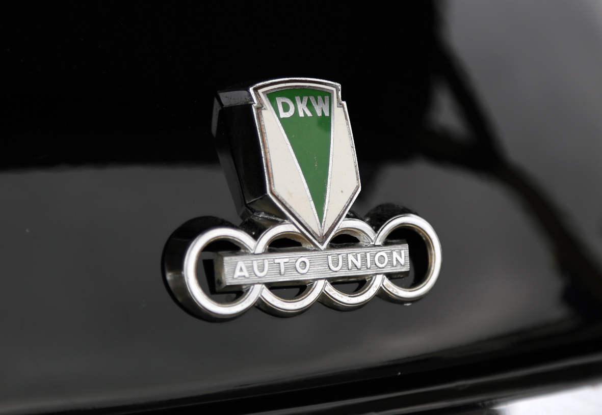
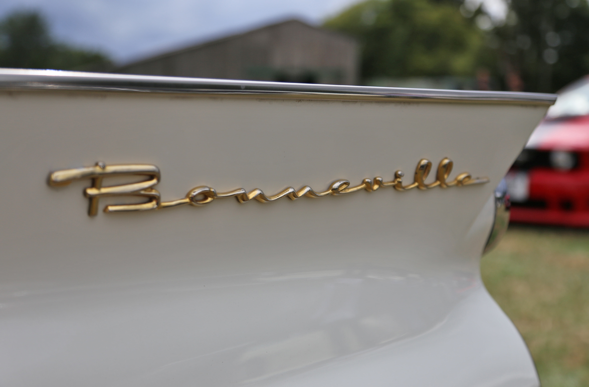
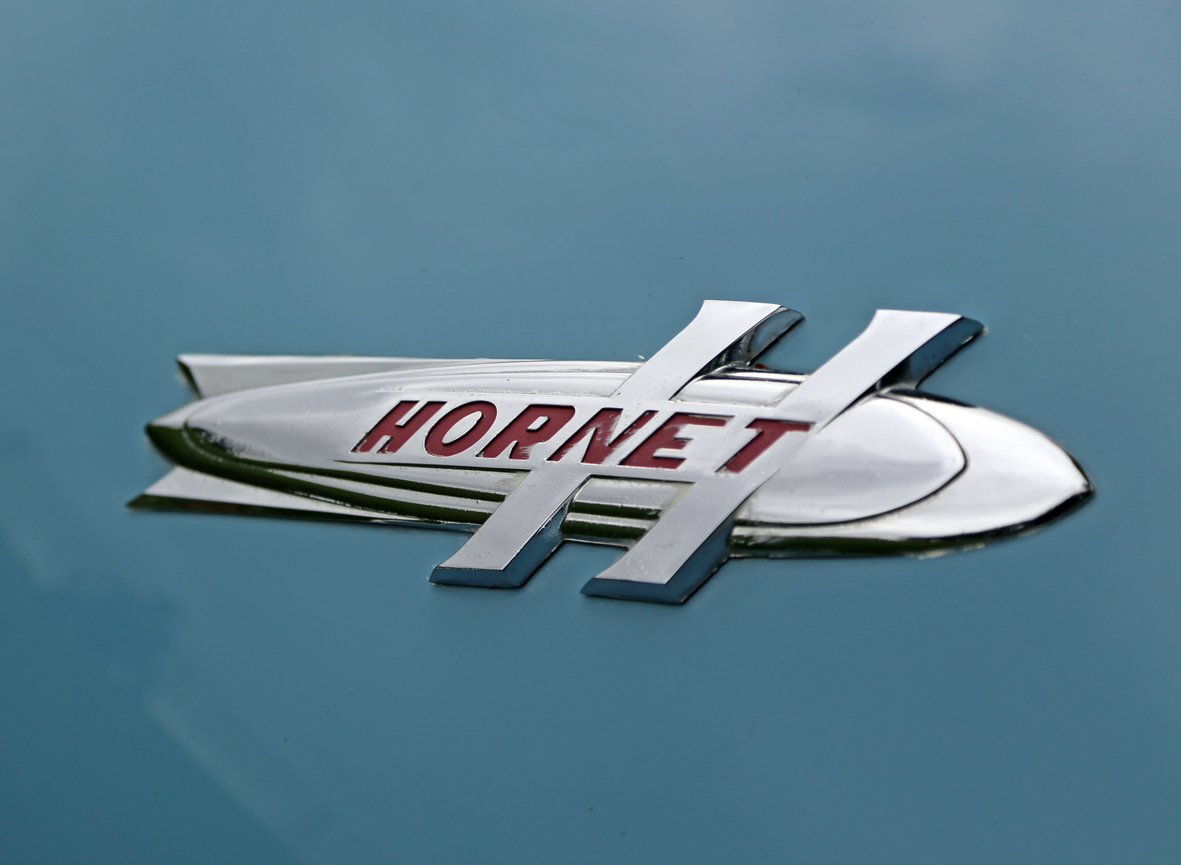
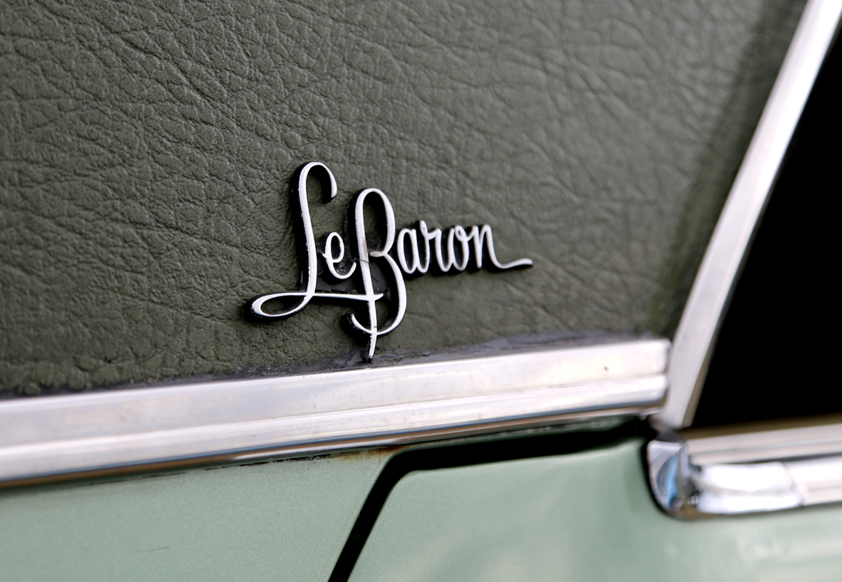
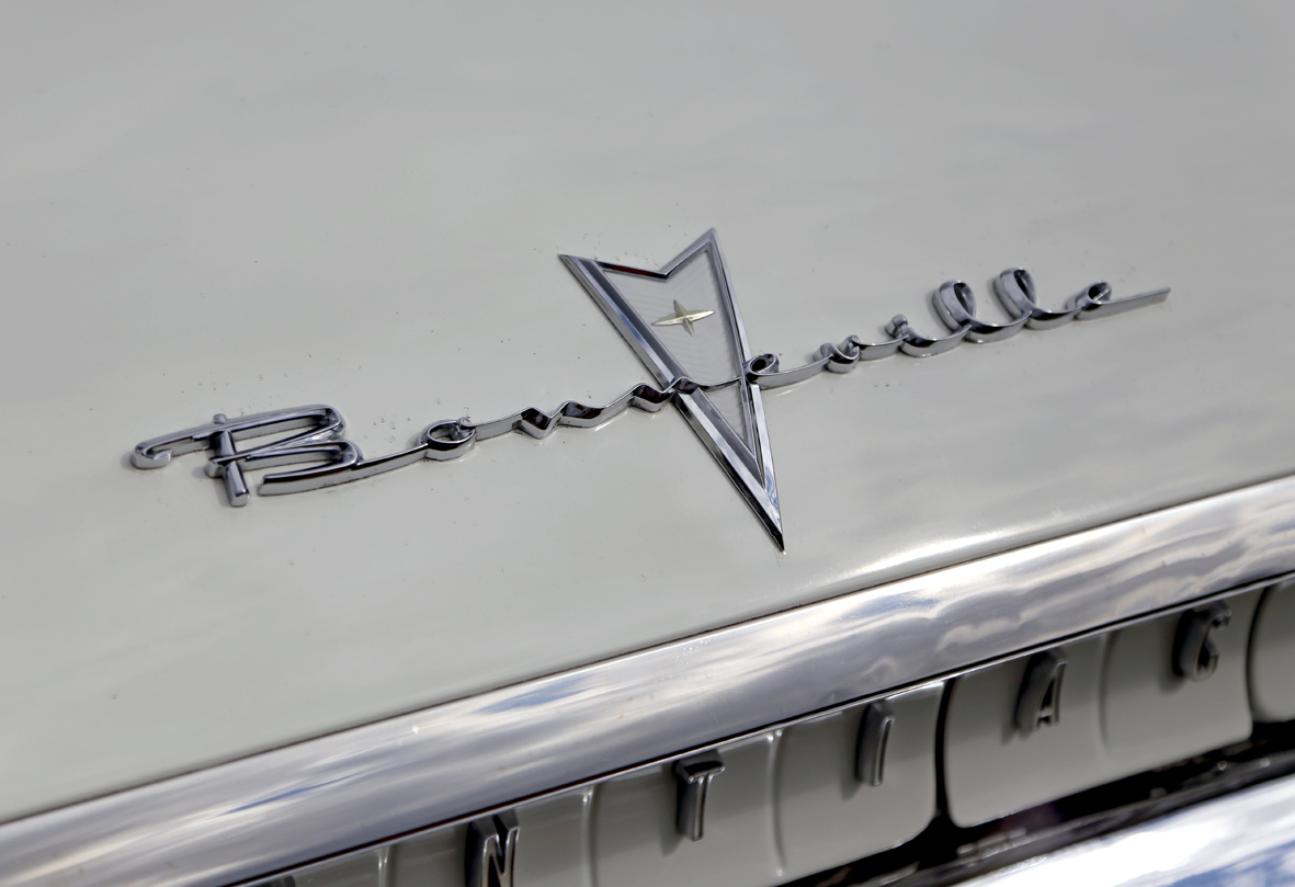
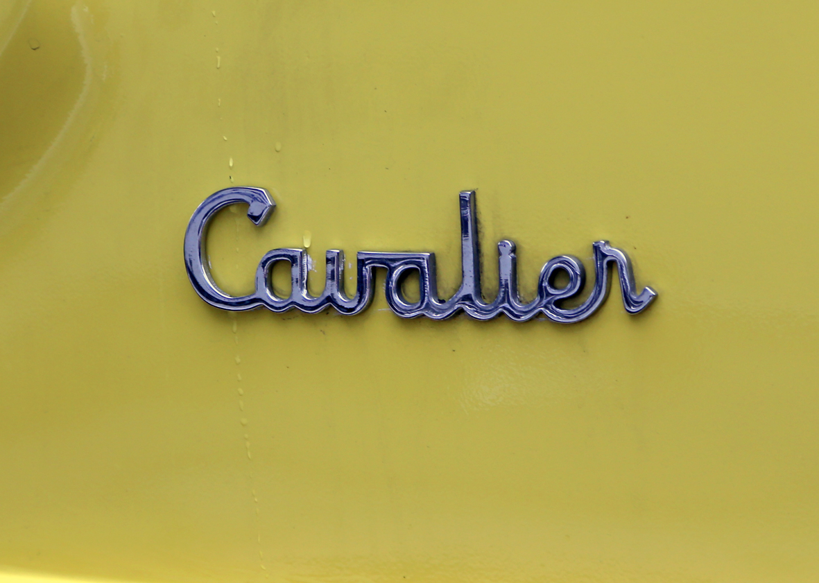
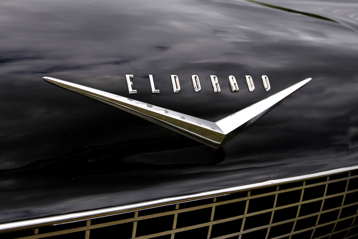
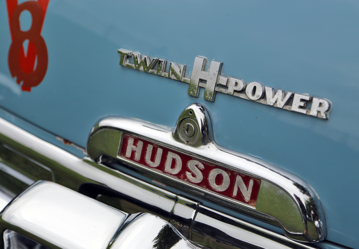
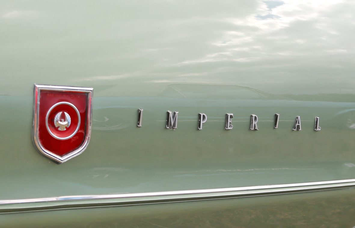
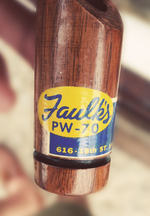
An eclectic selection of lettering from mainly American cars, with the exceptions of the DKW Auto Union and the Harrington Cavalier.
The DKW 3-6 Sonderklasse is a rare German beast and from the actual car that racing legend Jim Clark drove in his first race at Crimond June 1956. The 'Cavalier' is from an English Harrington Cavalier Coach.
Rarety aside though, the Hornet lettering has to be my favourite on that lovely 50s rocket-shaped chrome - beautiful!
See our full Auto Type collection here and here.
https%3A%2F%2Fwww.deliciousindustries.com%2Fauto-type-xxvxiv
Delicious+Industries%3A+Auto+Type+XXVXIV
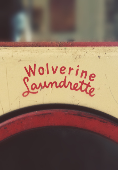
Type Hunting
Type Hunting have a great selection of type and lettering images on their Tumblr. Some very good mid-week inspiration.
Makes me think I should pull all my found type images together and create a Found Type Tumblr. Watch this space!
Via Sell! Sell! Blog.
https%3A%2F%2Fwww.deliciousindustries.com%2Ftype-hunting
Delicious+Industries%3A+Type+Hunting
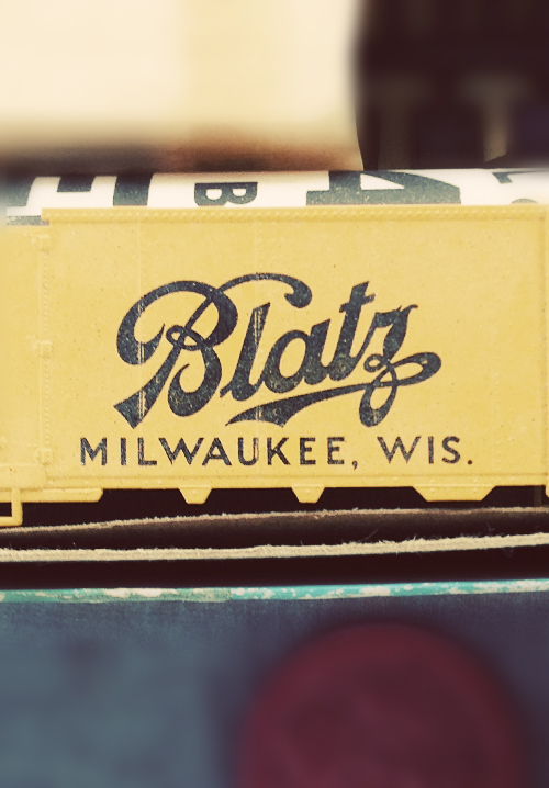
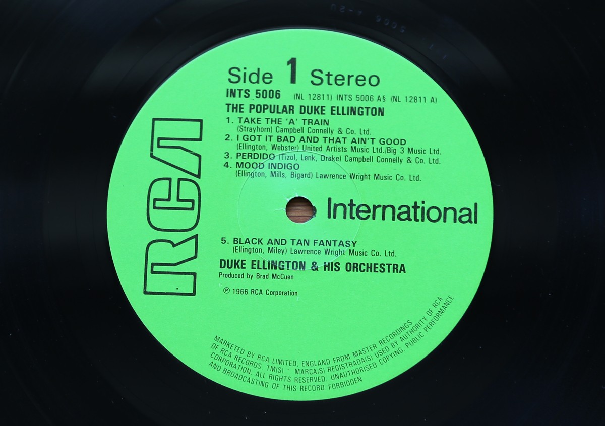
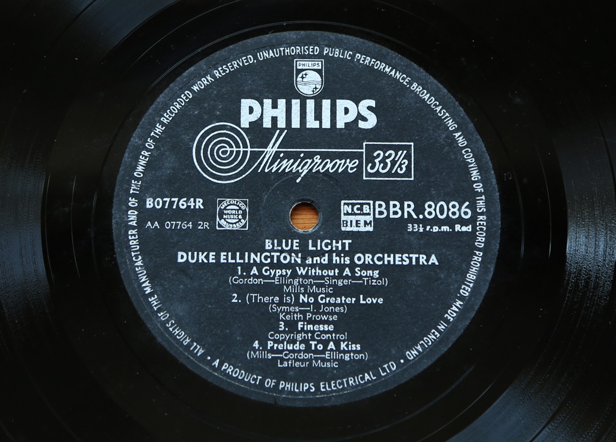
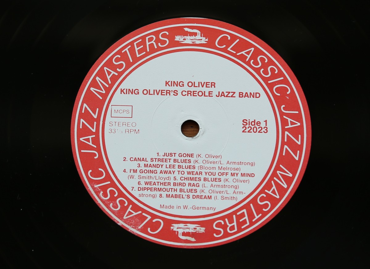
Record Centre Labels - part 2
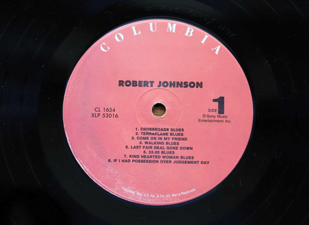
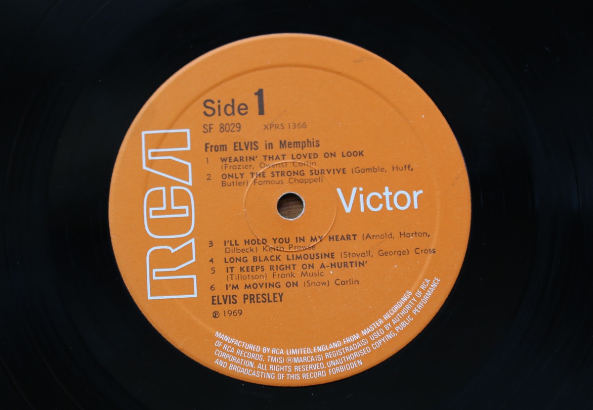
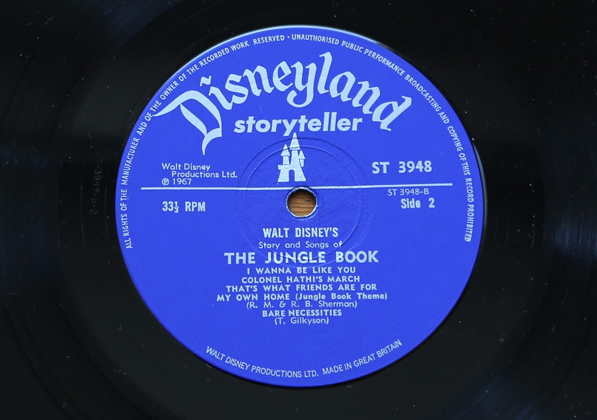
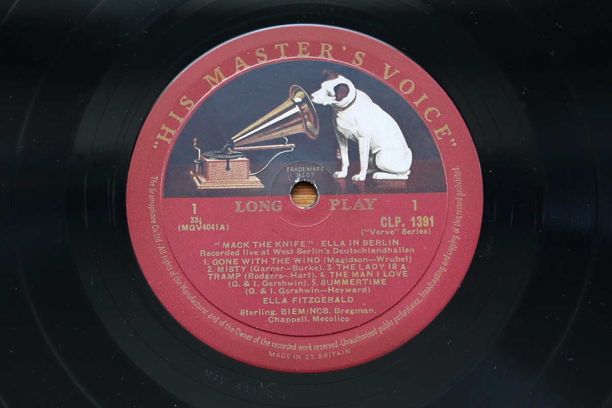
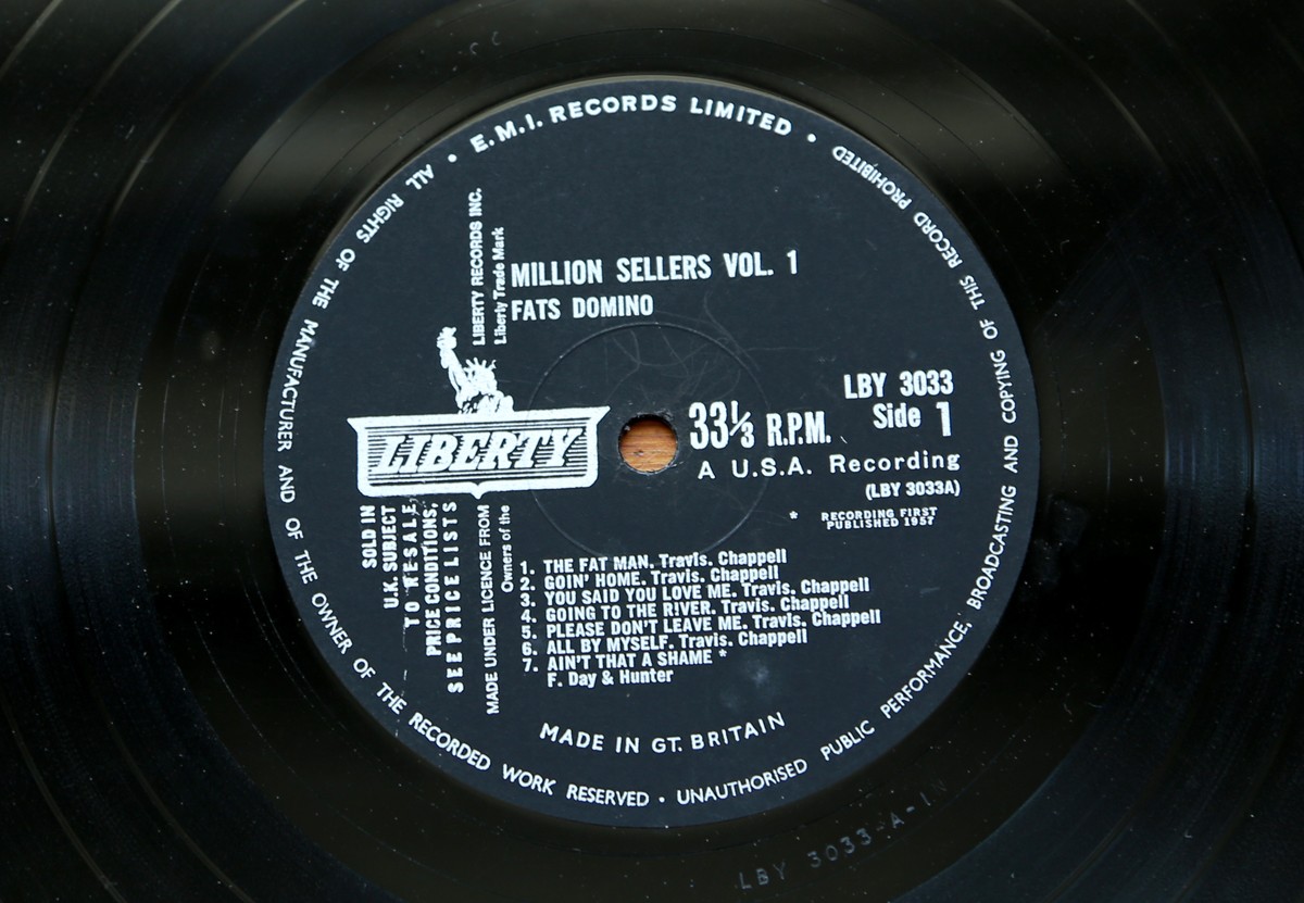
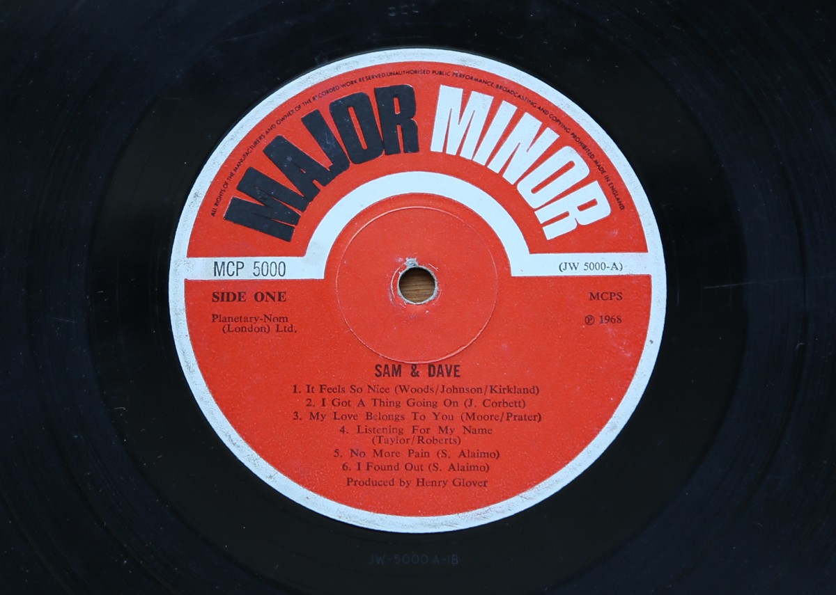
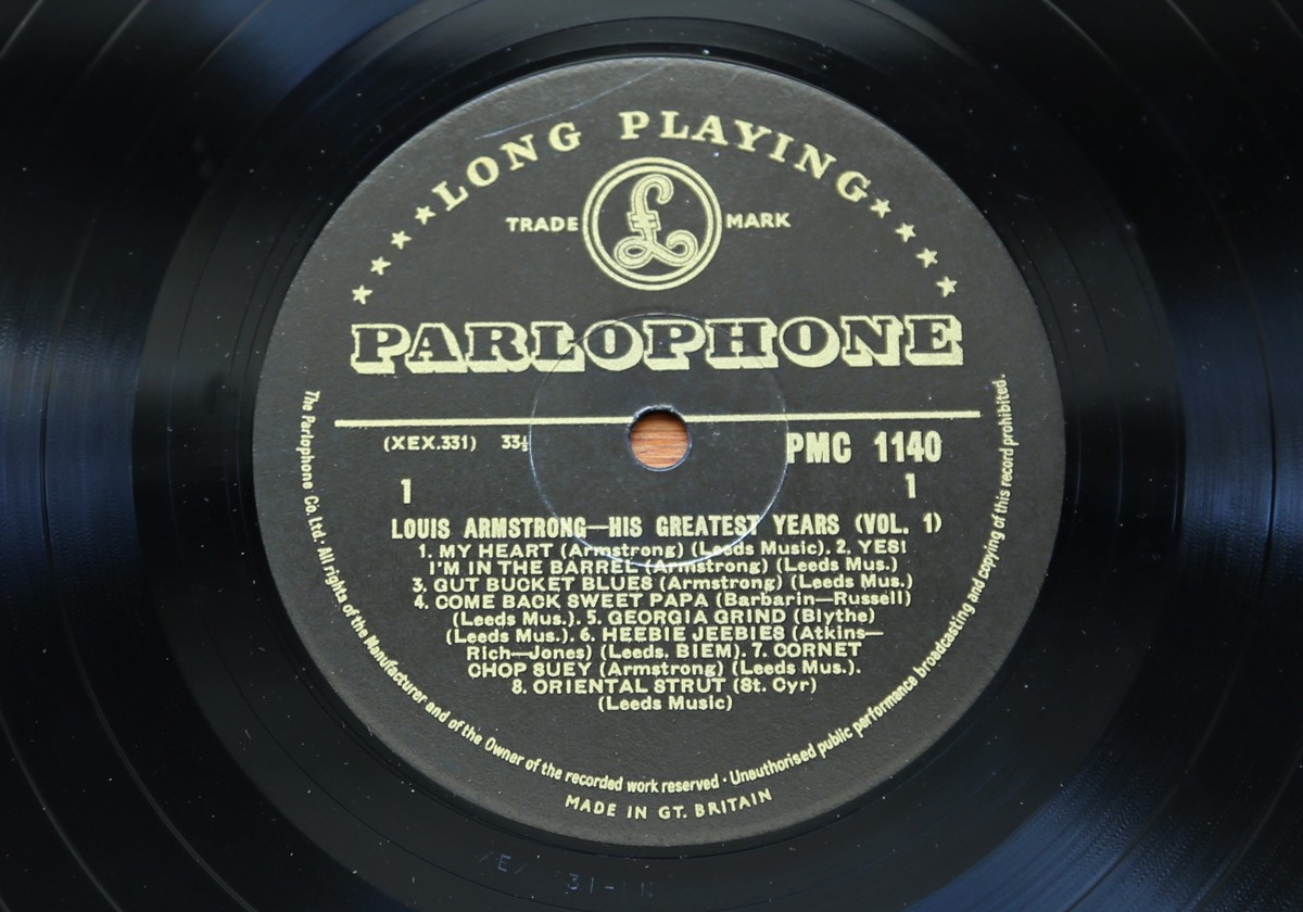
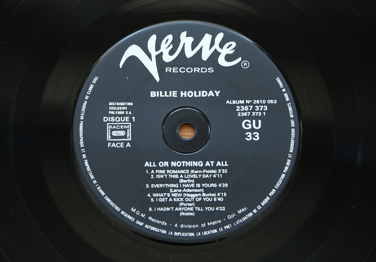
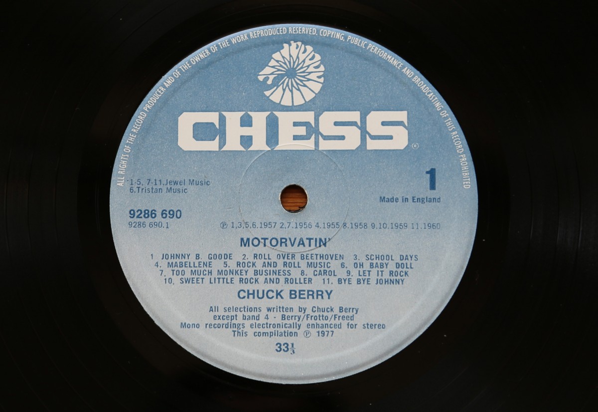
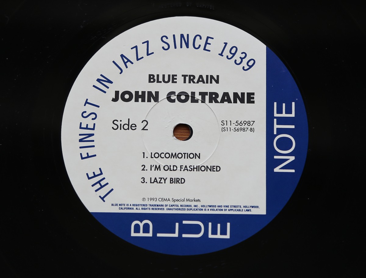
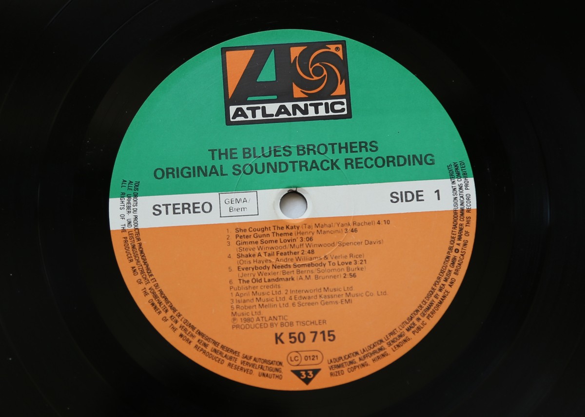
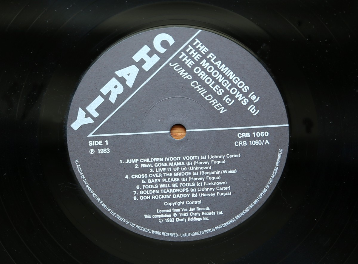
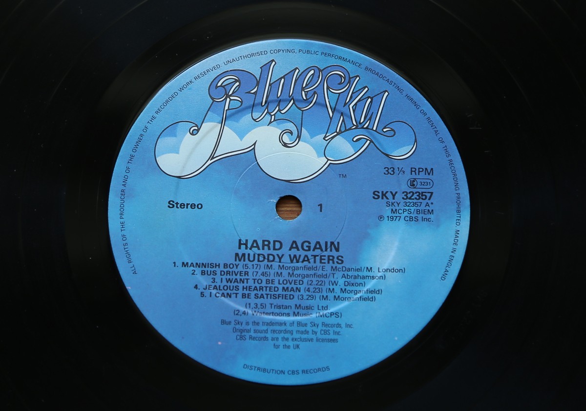
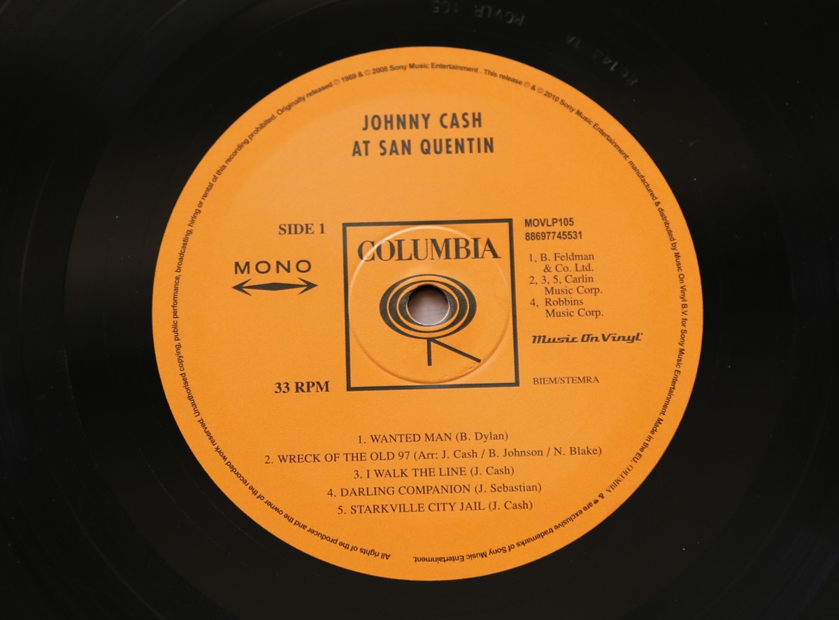
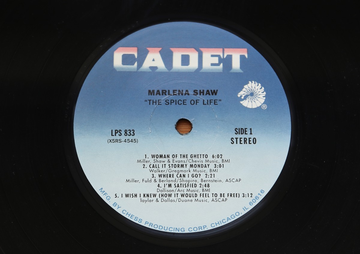
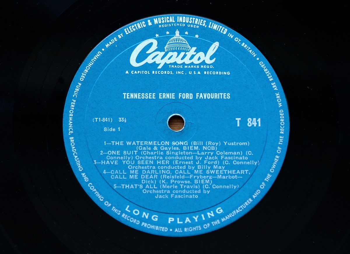
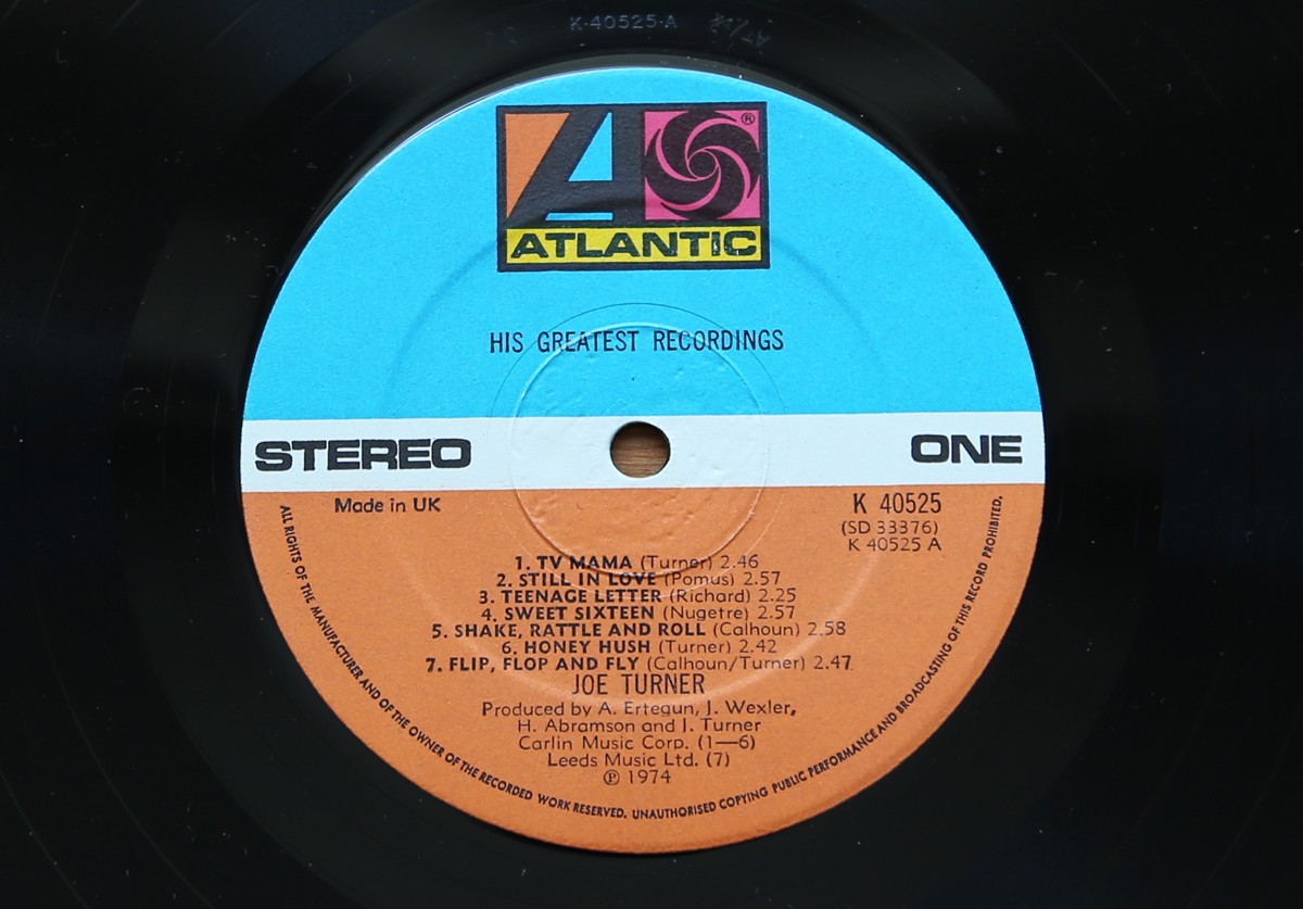
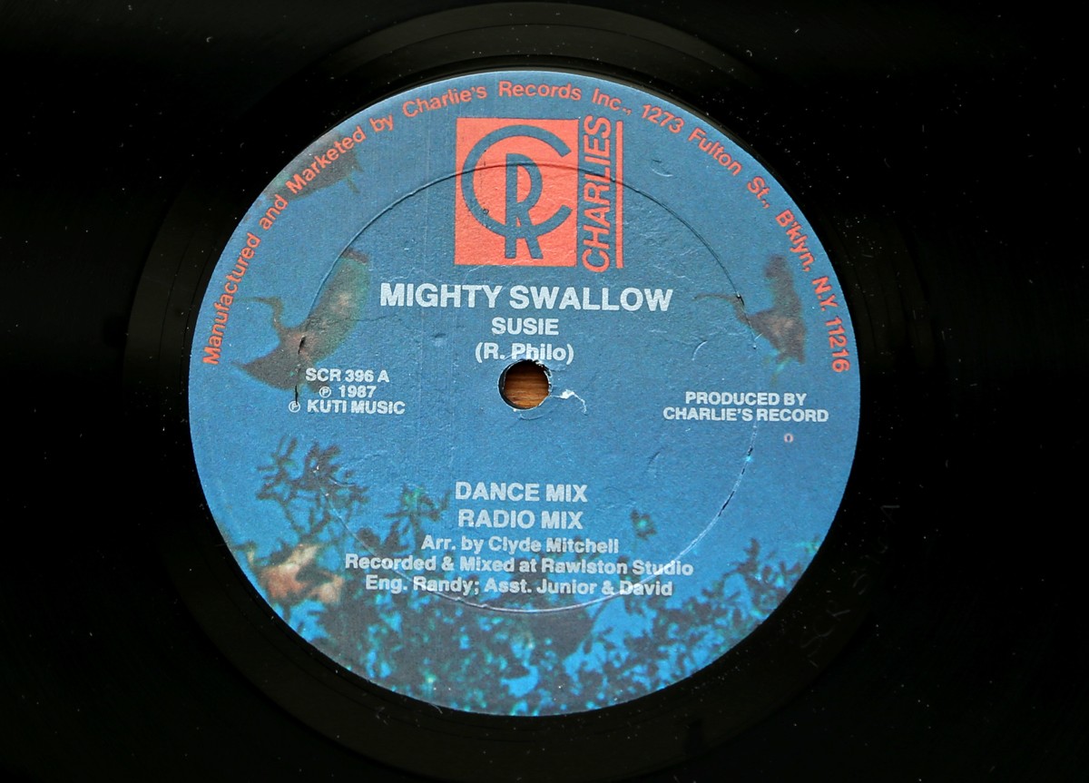
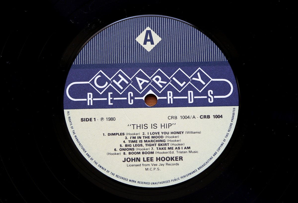
So here it is, part two of my record centre label collection...
They're all great, but I love the simplicity of the Columbia label and the lettering on the Verve label the most.
https%3A%2F%2Fwww.deliciousindustries.com%2Frecord-centre-labels-part-2
Delicious+Industries%3A+Record+Centre+Labels+-+part+2
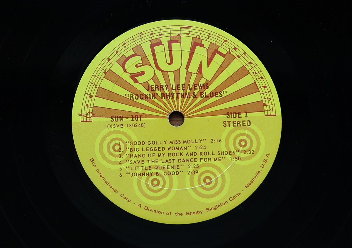
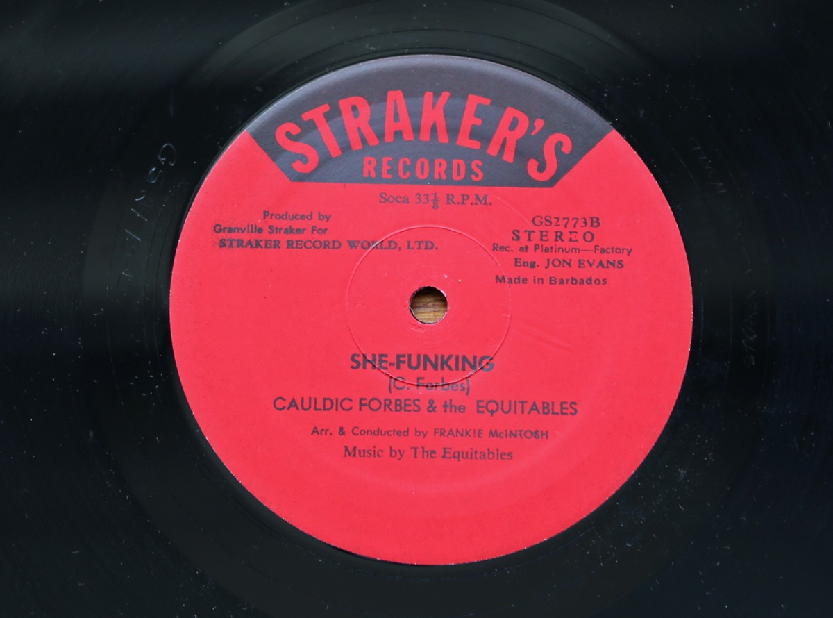
Record Centre Labels - part 1
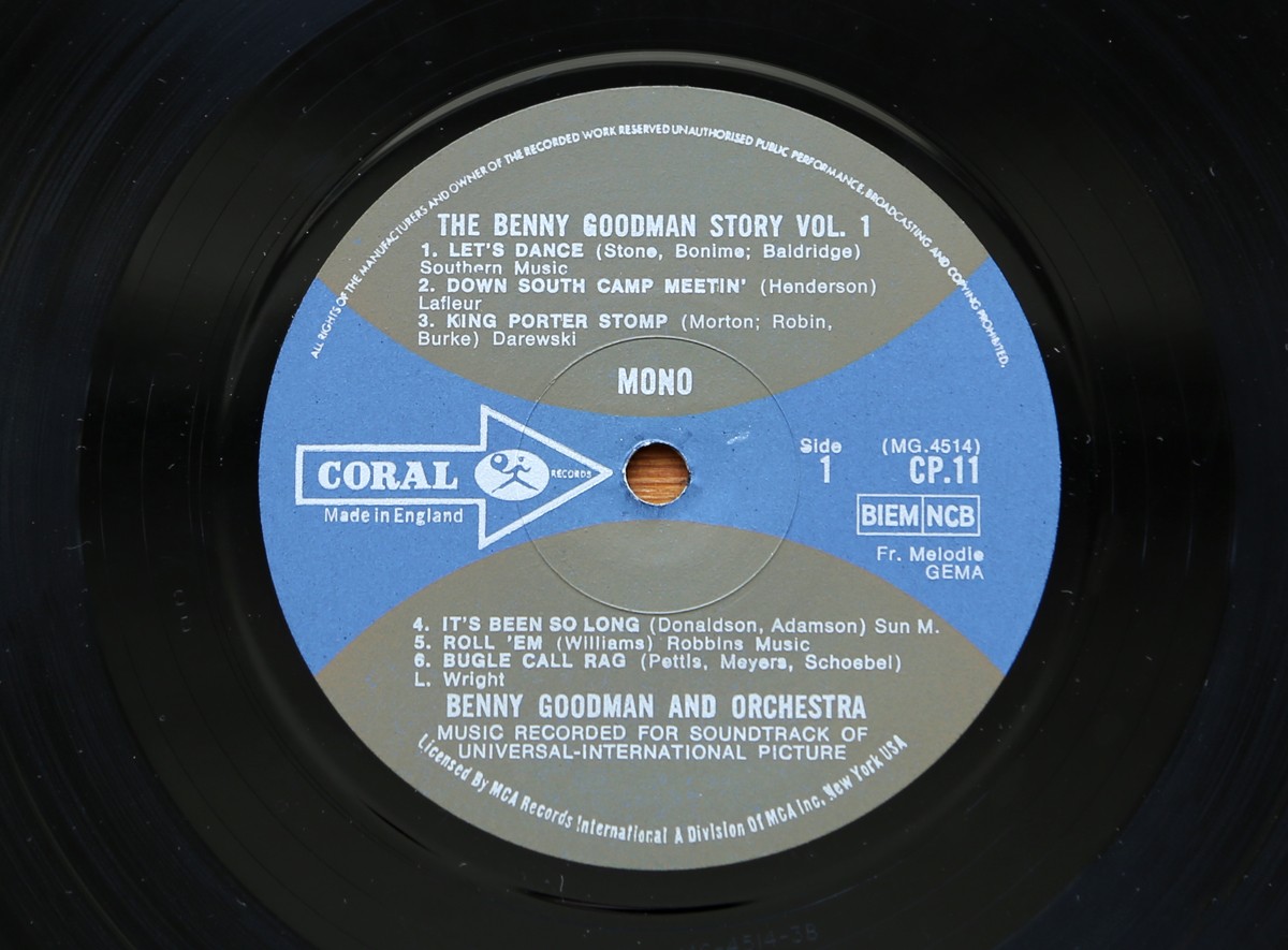
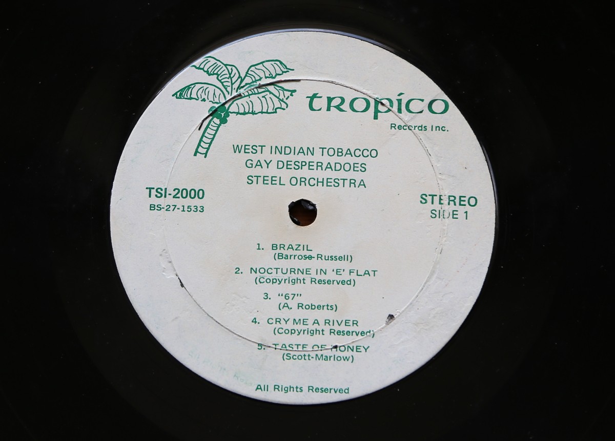
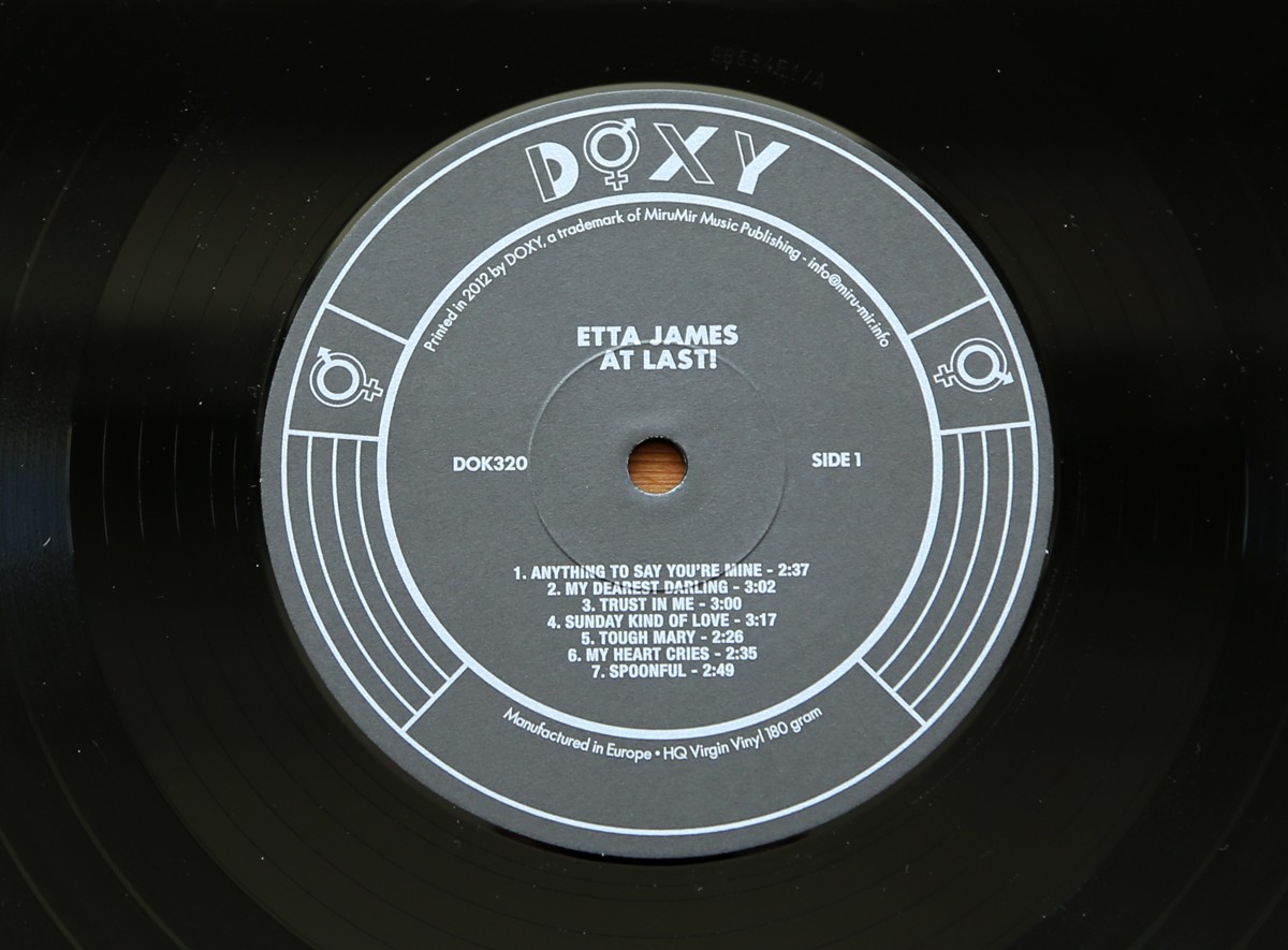
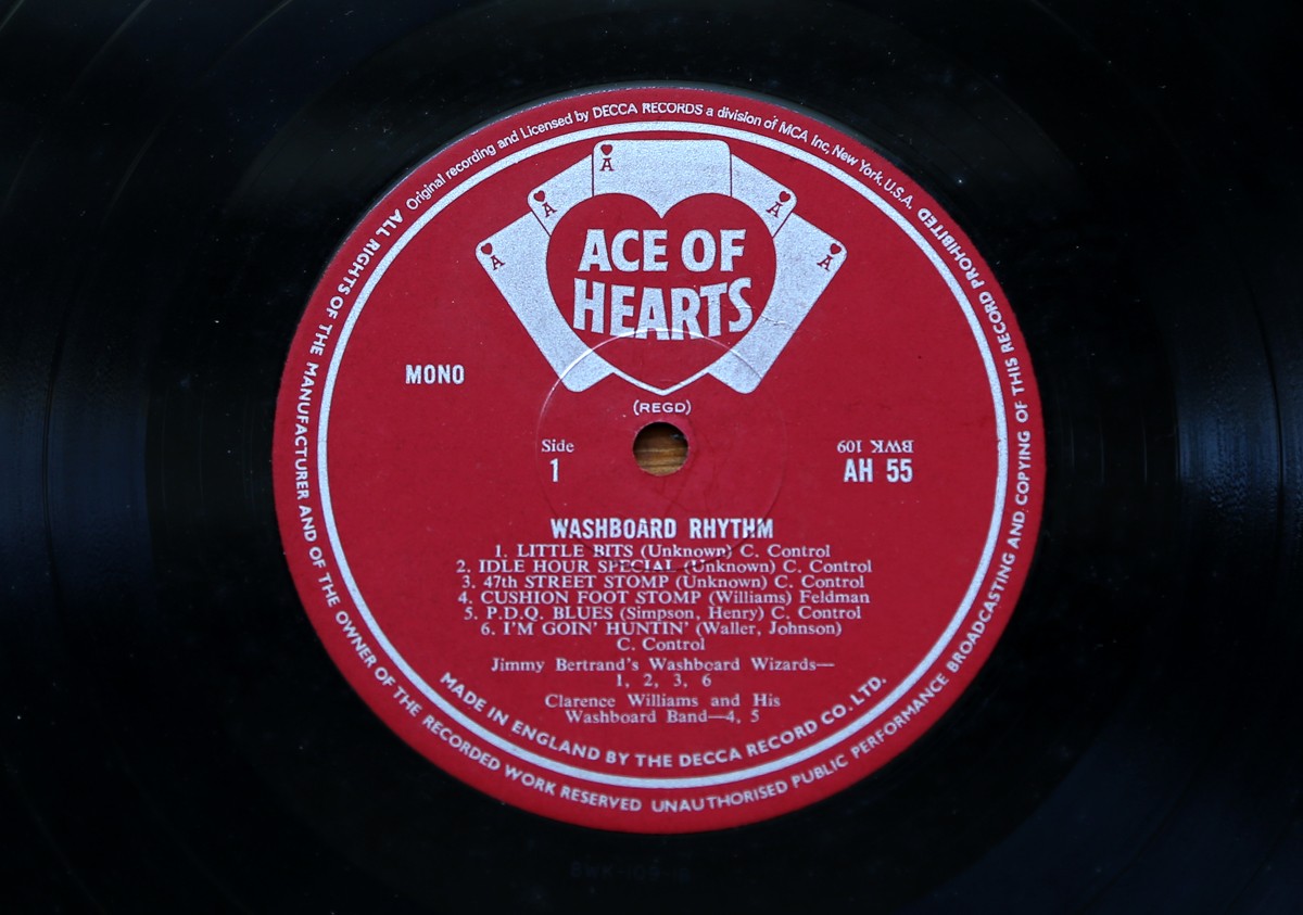
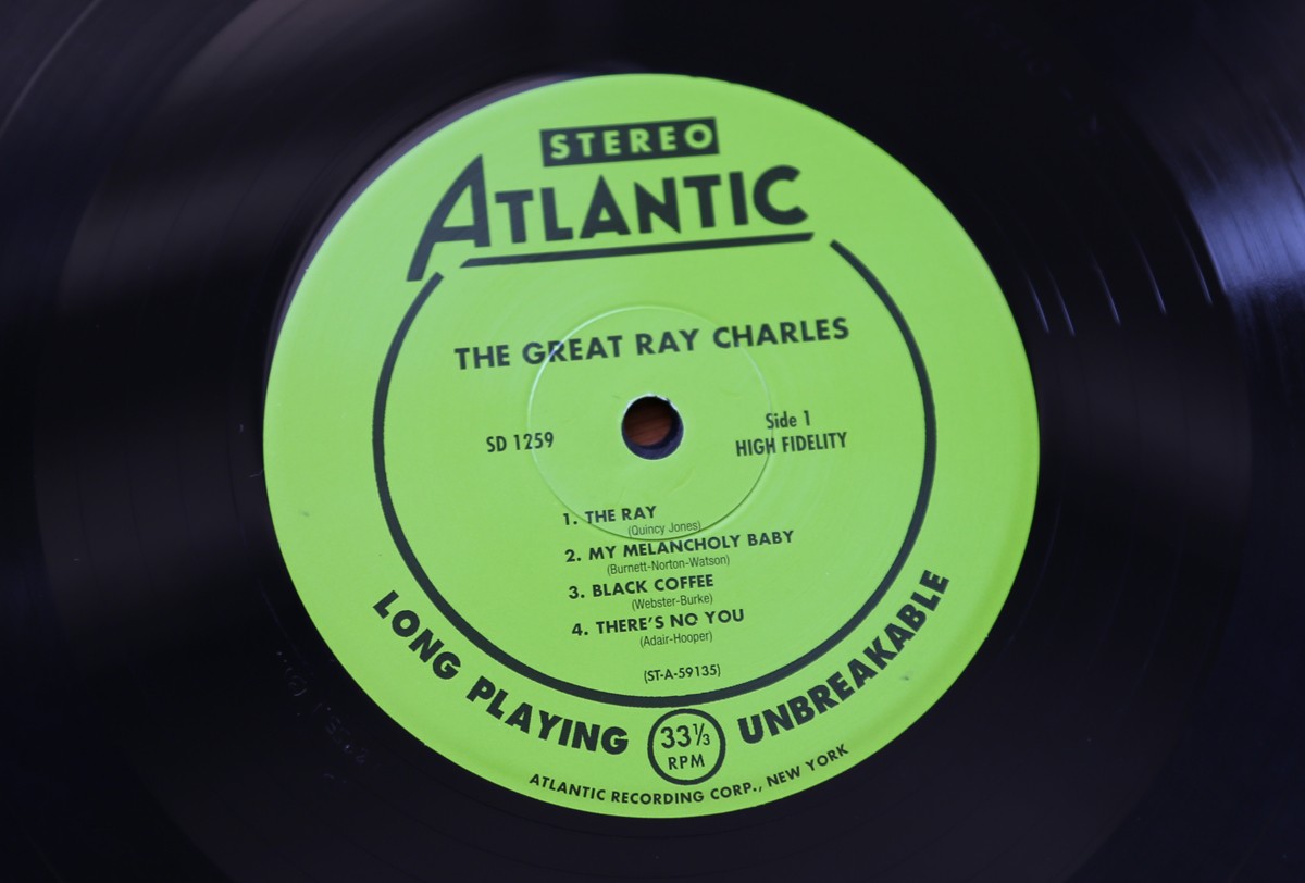
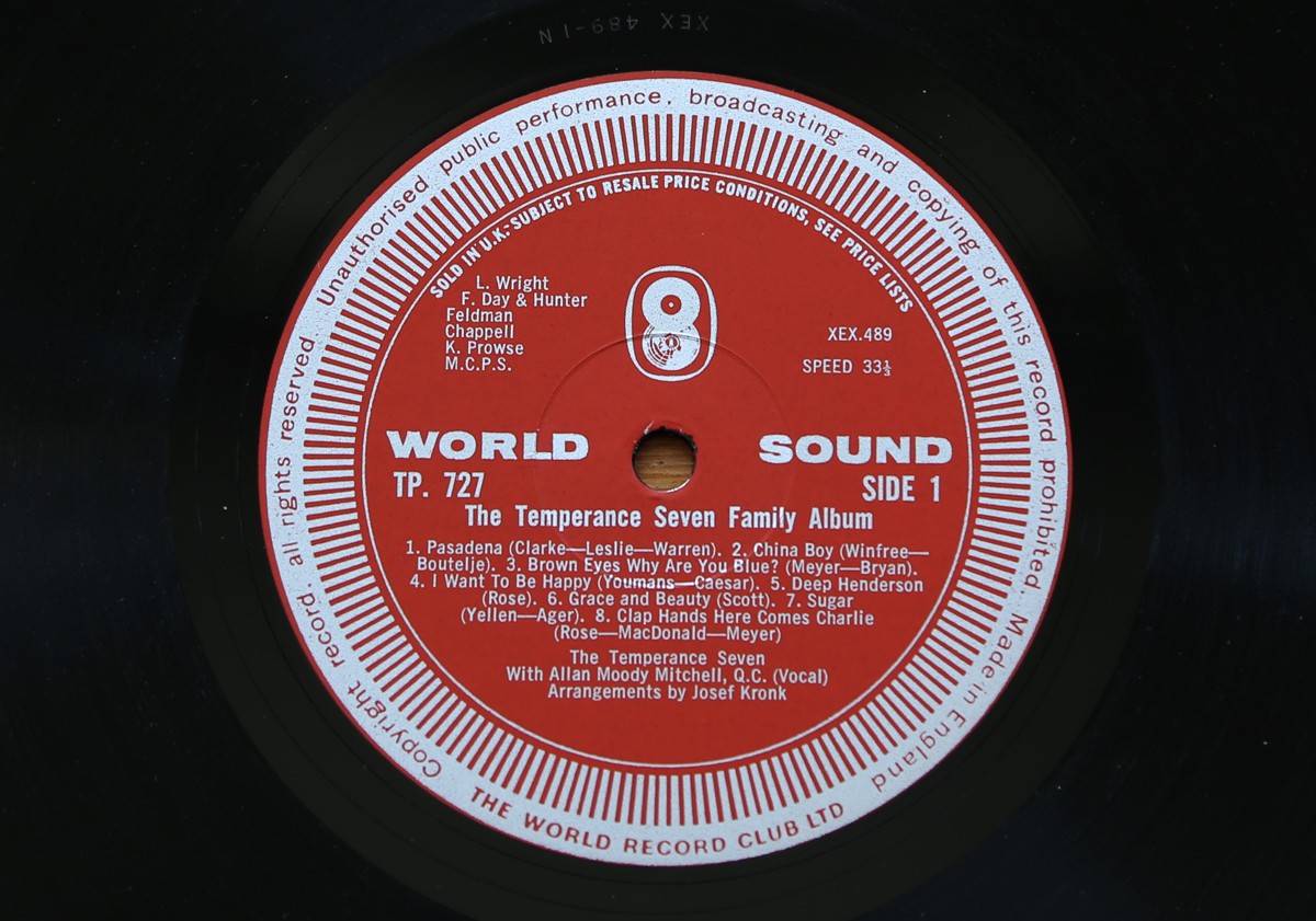
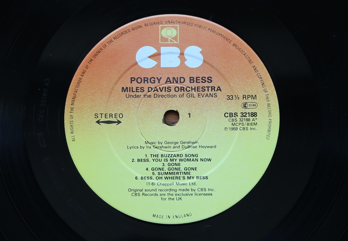
Part one of my record centre label collection.
Most range from the 50s to 70s with the odd later one thrown in for good measure.
When I buy vinyl it's always exciting to see the label - I enjoy the labels almost as much as the music and always more than the covers.
Watch out for part two next week.
https%3A%2F%2Fwww.deliciousindustries.com%2Frecord-centre-labels-part-1
Delicious+Industries%3A+Record+Centre+Labels+-+part+1
Australian Art Deco & Art Deco Style Signage


I'm lucky that Brighton has many wonderful examples of Art Deco architecture & signage, but when you see them so regularly it's easy to take them for granted. I often think about taking the camera out and shooting them properly, but I never seem to find the time. These pics have inspired me to finally do it though, so watch this space.
Images copyright Truffle Pig.
Via Notcot.
https%3A%2F%2Fwww.deliciousindustries.com%2Faustralian-art-deco-art-deco-style-signage
Delicious+Industries%3A+Australian+Art+Deco+%26amp%3B+Art+Deco+Style+Signage
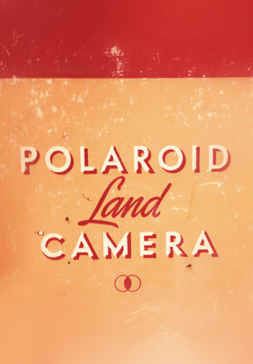
Auto Type XXVXII


Lots of weathered emblems and patina paint in this bunch but that just adds to their beauty. I particularly like the Country Squire and the Ranch Wagon - two I haven't seen before!
Check out our other Auto Type here or go to our Flickr set.
https%3A%2F%2Fwww.deliciousindustries.com%2Fauto-type-xxvxii
Delicious+Industries%3A+Auto+Type+XXVXII
Hand-lettered linocuts for AT Open House


https%3A%2F%2Fwww.deliciousindustries.com%2Fhand-lettered-linocuts-for-at-open-house
Delicious+Industries%3A+Hand-lettered+linocuts+for+AT+Open+House
Auto Type XXVXI


If you need a break this afternoon, make a cuppa grab a biscuit and check out our full Auto Type collection here or here.
https%3A%2F%2Fwww.deliciousindustries.com%2Fauto-type-xxvxi
Delicious+Industries%3A+Auto+Type+XXVXI
Howdoos back in stock!


Our Etsy shop is now fully stocked with a fresh batch of Howdoos - business cards for everyone + anyone.
Hand letter-pressed onto a thick, pulpy beermat stock these personalisable business cards have 'hello' (hot pink) or 'nice to meet you' (black) on the front and 3 blank spaces on the reverse for your contact details.
https%3A%2F%2Fwww.deliciousindustries.com%2Fhowdoos-back-in-stock
Delicious+Industries%3A+Howdoos+back+in+stock%21
Sell! Sell!'s Efficacious Fentimans Ad


I think you'll agree it was well worth the effort, you can really tell the difference between this and previous ads which have been created purely digitally - this one has so much more charm and depth.

Images copyright Sell! Sell!
https%3A%2F%2Fwww.deliciousindustries.com%2Fsell-sells-efficacious-fentimans-ad
Delicious+Industries%3A+Sell%21+Sell%21%26%23039%3Bs+Efficacious+Fentimans+Ad
Printer's Pie

Printer's Pie was commissioned by Fuller's Ltd. for the newly refurbished 'Jiffy Bar' in their Ludgate Circus restaurant - right by Fleet Street in the heart of London's print-land.
The mural, "composed entirely of a giant photograph of letters chosen from nearly four hundred of the type alphabets used in modern printing and general lettercraft" includes names of UK newspapers, typefaces, type foundries and type designers. It's also thought to be the first public presentation of the Mistral typeface, designed by Roger Excoffon for the Fonderie Olive, Marseillies in 1955.
In December 1955 Printing News used Printer's Pie as the basis of a type identification competition and it was also the theme of 'Typographical Centre' exhibitions at Southgate Library and at the Bastien Studio during the 'International Typographical Year 1957'.
I have no idea if the mural still exists, but here it is in all it's glory back in 1955...

https%3A%2F%2Fwww.deliciousindustries.com%2Fprinters-pie
Delicious+Industries%3A+Printer%26%23039%3Bs+Pie
Live a Quiet Life…


It's available here and comes in Black Licorice (main pic), Paver Red, Timber Green or Nightshift Blue.
Images copyright Dana Tanamachi.
https%3A%2F%2Fwww.deliciousindustries.com%2Flive-a-quiet-life
Delicious+Industries%3A+Live+a+Quiet+Life%26%238230%3B
The love of imperfection


https%3A%2F%2Fwww.deliciousindustries.com%2Fthe-love-of-imperfection
Delicious+Industries%3A+The+love+of+imperfection
From the reference box #136


https%3A%2F%2Fwww.deliciousindustries.com%2Ffrom-the-reference-box-136
Delicious+Industries%3A+From+the+reference+box+%23136
Auto Type XXVX


If Auto type is your thing, check out the rest of our collection here and here.
https%3A%2F%2Fwww.deliciousindustries.com%2Fauto-type-xxvx
Delicious+Industries%3A+Auto+Type+XXVX
Welcome

Welcome to the Delicious Industries blog. We're an independent design studio based in Brighton, UK and this is our scrapbook packed full of design, illustration, photography & typography inspiration. Check out our work here.
Links
DELICIOUS FRIENDS
DELICIOUS FAVOURITES
- 50 Watts
- Acejet 170
- Grain Edit
- It's Nice That
- National Geographic Found
- Notcot
- Pretty Clever
- Retronaut
- So Much Pileup
- We Love Typography
- Another Mag