art direction, design + typography
Blog: Packaging
Draplin's Show and Tell


It's reassuring to know I'm not the only person with drawers full of what most people would call 'old crap', but that I call 'design reference'.
The images above are stills from Level Mag's Show and Tell with Portland's renowned graphic designer, Aaron Draplin of Draplin Design Co.
Filmed by Jared Sourney whilst video-documenting Draplin for a snowboard website, the clip shows, "a guided peak into the big man’s drawers of dirty delights"!
Watch the full video here.
Stills/footage copyright Level Mag.
Via Notcot.
https%3A%2F%2Fwww.deliciousindustries.com%2Fdraplins-show-and-tell
Delicious+Industries%3A+Draplin%26%23039%3Bs+Show+and+Tell
From the reference box #102


#102 - more vintage tins, small but perfectly formed!
The Songster Gramaphone Needles tin (top) is my favourite of this bunch. All that detailed design, illustration and typography on such a small tin - it's easy to see why they have become so desirable in recent years.
I think the Snowfire Jelly tin (middle) is from the 1940's - Snowfire Jelly was a hand cream, "for beautiful hands".
The QA Brand Tablet tin (bottom) is really, really small - only 25mm high and 12mm in diameter. QA Brand "quick acting Asprin" were produced by Thompson & Capper, a homeopathic chemist company based in Liverpool.
As always, there's lots more vintage packaging and ephemera in the reference box if you feel like a root around.
https%3A%2F%2Fwww.deliciousindustries.com%2Ffrom-the-reference-box-102
Delicious+Industries%3A+From+the+reference+box+%23102
More Vintage Packaging


There's nothing better on a Monday morning than some vintage packaging! This wonderful selection is from Neato Coolville's Vintage Packaging Flickr set.
My favourite is the little 1960's box for Rediplete Pediatric Syrup (above) made by Merck Sharp & Dohme - it's such a clever, fun design.
It's a great collection, which is definitely worth a look. Here are a few more that caught my eye...
My favourite is the little 1960's box for Rediplete Pediatric Syrup (above) made by Merck Sharp & Dohme - it's such a clever, fun design.
It's a great collection, which is definitely worth a look. Here are a few more that caught my eye...


https%3A%2F%2Fwww.deliciousindustries.com%2Fmore-vintage-packaging
Delicious+Industries%3A+More+Vintage+Packaging
From the reference box #101


#101 - Vintage tins. There can never be enough vintage tins in the reference box! My favourite of this little lot is the John Bull, Mend-a-tear one (top) with it's stripey-edged lid. You can't really tell in the pic, but it has a lovely pale grey background. I really love the Ogden's and Bondman type too.
If vintage tins and ephemera are your thing - make a cup of tea, grab a biscuit and have a root through our reference box.
https%3A%2F%2Fwww.deliciousindustries.com%2Ffrom-the-reference-box-101
Delicious+Industries%3A+From+the+reference+box+%23101
John Hollows Superior Alcoholic Ginger Beer

Congrats to our friends over at Sell! Sell! for creating the fabulous branding and advertising for Fentiman's new Alcoholic Ginger Beer - John Hollows.
Research is my favourite part of a project, so I loved reading about the branding and how it developed through their research into Fentiman's and Hollow's brewing history.
The advertising is bold and fun, challenging the 'fake' ginger wine-based or flavoured lager ginger beers of the competition and warning customers, 'Beware of imitations'...

And to promote the new drink in pubs and bars, they've created the 'not a genuine ginger?' beermat - perfectly designed to disguise yourself as a true ginger...

Read more about the project here.
Images copyright Sell!Sell!
https%3A%2F%2Fwww.deliciousindustries.com%2Fjohn-hollows-superior-alcoholic-ginger-beer
Delicious+Industries%3A+John+Hollows+Superior+Alcoholic+Ginger+Beer
Giant Sellotape Tin


The vintage Sellotape tins have become a bit of an obsession and I now have quite a collection including this fabulous example. It's a large (165mm [6.5"] high & 120mm [4 5/8"] diameter) tubular tin designed to hold a stack of 12 individual tins.
I think this is how they were sold to retailers/trade, so I don't think they were ever available to the general public unless they were buying 12 rolls!
I love this tape on the side with the contents information on...

This was the only large Sellotape tin I had ever seen on Ebay but this current listing has 8 tins in total, 2 of which are like this. I desperately want the two with the black stripes on, but I'm holding back. I think there's a limit to the number of Sellotape tins any one person should own and I've definitely already passed it, especially as I bought an older version of this one last night! (below).

https%3A%2F%2Fwww.deliciousindustries.com%2Fgiant-sellotape-tin
Delicious+Industries%3A+Giant+Sellotape+Tin
Mmmmmm cheese…


I love a collection, and one that combines cheese and design just has to be worth a post! These wonderful cheese labels circa 1957 are part of a collection large found in a scrapbook on Ebay and featured in Culture Magazine.
Read the full story over on Design Observer.
Images copyright Culture Magazine.
https%3A%2F%2Fwww.deliciousindustries.com%2Fmmmmmm-cheese
Delicious+Industries%3A+Mmmmmm+cheese%26%238230%3B
From the reference box #96

It's a very thick paper bag designed to carry home your ice-cream. I have no idea what year it's from, but I would guess at mid 60's or even early 70's judging by the design and print quality.
Have a good old rummage around the rest of our reference box here.
https%3A%2F%2Fwww.deliciousindustries.com%2Ffrom-the-reference-box-96
Delicious+Industries%3A+From+the+reference+box+%2396
From the reference box #90


#90 - Vintage throat lozenges circa 1950. I bought a few of these packages at a boot sale recently and have since found out a bit about the companies. Bradosol Antiseptic Lozenges are still available today, but these sample packs (above) are from when they were first introduced to the market in the early 50's by CIBA Laboratories, Horsham, England.
CIBA (Company for Chemistry Industry Basel or Gesellschaft für Chemische Industrie Basel) was a Swiss company started in the 1800's that first opened factories in the UK in 1911. It merged with Geigy in 1970 to create Ciba-Geigy Ltd and in 1996 they merged with Sandoz to form the pharmaceutical giant we know today as Novartis.
Here's an information booklet selling Bradosol, "to the Dental Profession".


I also found a sample/specimen pack of Collozets mouth and throat lozenges (below), "Manufactured in England by The Crookes Laboratories Limited, Park Royal, London".


I can't find out anything about Crookes Laboratories, but I did find this advert for Collozets from the late 50's...

If you want to see more delicious packaging and ephemera have a root around here.
https%3A%2F%2Fwww.deliciousindustries.com%2Ffrom-the-reference-box-90
Delicious+Industries%3A+From+the+reference+box+%2390
Vintage coffee tins


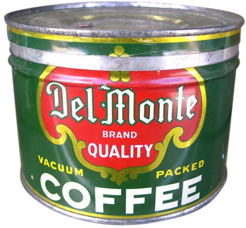

I love these 40's and 50's coffee tins from Roadsidepictures' (US photographer, Allen) collection of vintage packaging and advertising on Flickr. There's so much to look at, this is definitely one of those sets you need a lot of time and a cuppa to really enjoy.
Allen says he's always enjoyed, "photographing old neon signs, cars, motels, gas stations, roadside attractions and suburban life" - all of which can be seen in his Flickr sets.
See more vintage packaging here, here and here or have a rumage through our reference box here.
Images copyright Allen at Roadsidepictures.
Via Notcot.
https%3A%2F%2Fwww.deliciousindustries.com%2Fvintage-coffee-tins
Delicious+Industries%3A+Vintage+coffee+tins
From the reference box # 86

#86 - Vintage Catarrh Pastilles packaging. I love the colour combo of this Boots packaging, not what you would expect for throat sweets.
I had thought it was circa 50's/60's but after looking at the Boots timeline I think it's more likely to be from the early 70's as it has both the original name 'Boots Pure Drug Company' and 'The Boots Company' (which it became in 1971) on it?? Still not convinced, but it's a great example never-the-less.
See more fabulous packaging and items of ephemera here.
https%3A%2F%2Fwww.deliciousindustries.com%2Ffrom-the-reference-box-86
Delicious+Industries%3A+From+the+reference+box+%23+86
Tiny Sellotape® Tins


The bottom one is of the same era as my others but the top one is much earlier - the logo has an outline so you can actually see how the Sellotape® logo started out (made up from a ribbon of tape). The logo/brand name 'Sellotape' has not yet been registered as a Trademark and the company name on the side of the tin is Adhesive Tapes Ltd., not Sellotape Products Ltd. as it is on the later ones. I love how it describes what Sellotape® does too, again indicating that it is an early tin, "No moistening" and "Adheres at touch".

If you're craving more information about Sellotape®, there's a brief history of the brand here.
https%3A%2F%2Fwww.deliciousindustries.com%2Ftiny-sellotape-tins
Delicious+Industries%3A+Tiny+Sellotape%C2%AE+Tins
Crisp Packet Exhibition at the De La Warr Pavilion


You may have read in the press this week about Dave Valentine and his £10,000 crisp packet collection! Well those of you lucky enough to live near Bexhill-on-Sea will have the opportunity to see the collection in it's entirety at the De La Warr Pavilion's, Collectors' Corner this Sunday (15 August).
Dave has been collecting the empty crisp packets since 1984 when he was 6 years old. Now 32, he has a collection of over 250 different examples (according to the dlwp, but 2 other sources say over 500!) many of which are no longer produced.
"The designs are so retro and cool. Crisp bags these days are a bit boring in comparison. People love the nostalgia of looking at the old packets - it takes them back in time and they get a real kick of that."
The collection will be available to view from 2.30pm onwards along with local artist Louise Kenward's collection of charity shop sourced ceramic figures.
"Louise has been collecting ceramic figurines for a number of years. For her, the significance of the figurines is their association with times past, commonly referencing the Victorian era and notions of nostalgia."
Some of their previous Collector's Corner exhibits can be seen here and if you have a collection you want to share find out how to appy here.
The De La Warr Pavilion in all it's modernist glory is worth a visit anyway on a sunny weekend, but add in an exhibition and their fabulous cream teas and it's a no brainer!
Top images copyright dlwp from their blog. Other images screen grabs from CBBC footage.
https%3A%2F%2Fwww.deliciousindustries.com%2Fcrisp-packet-exhibition-at-the-de-la-warr-pavilion
Delicious+Industries%3A+Crisp+Packet+Exhibition+at+the+De+La+Warr+Pavilion
From the reference box # 81


#81 - Small, round vintage tins; Ucal Brand's Zinc Ointment and Chesebrough-Pond's Vaseline. I love these little tins, especially the type on the Zinc Ointment one, it's very ornate in total contrast to the Vaseline one with it's functional, simplicity. Each tin is only 65mm (approx. 2.5") in diameter, but they look great on the book shelf.
As ever I've done a bit of research into the companies and found out that Chesebrough (originally an oil business, whose founder chemist Robert Augustus Chesebrough produced the first petroleum jelly in 1859) merged with Pond's Creams in 1955 to form Chesebrough-Pond's before being bought by Unilever in 1987. I've seen other Vaseline tins from the Chesebrough-Pond's era that definitely look older than this one, soa I'm guessing mine is from the late 60's or early 70's.
Unfortunately I can't find out anything about Ucal brand who manufactured the Zinc Ointment, other than they seemed to have produce a variety of Throat Lozenges, Pastilles and Health Salts in the late 50's.
For more reference box loveliness, have a root around here.
https%3A%2F%2Fwww.deliciousindustries.com%2Ffrom-the-reference-box-81
Delicious+Industries%3A+From+the+reference+box+%23+81
From the reference box # 79

The Fischer Autolicht (above) is a spare for a 50's/60s Helphos spotlight. It's so gorgeous - simple 2 colour, with the 50's type and the bulb graphic.
However, the Neon Crucifix* (below) is my favourite - how many neon crucifix bulbs have you ever seen?? The packaging is fantastic and looking at the type I'm guessing it's also from the 50's/60's. Such a random item it's hard not to love it.
*update to this post*
After a bit of research I've discovered that these neon crucifix bulbs are manufactured for churches and are still available (although not in red as the one above or with the retro packaging) here.


If you like looking at random vintage items of ephemera, take a look through the rest of our reference box.
*Big thanks to Carl Rush of Crush for giving me the neon crucifix a few years ago!
*Big thanks to Carl Rush of Crush for giving me the neon crucifix a few years ago!
https%3A%2F%2Fwww.deliciousindustries.com%2Ffrom-the-reference-box-79
Delicious+Industries%3A+From+the+reference+box+%23+79
Welcome

Welcome to the Delicious Industries blog. We're an independent design studio based in Brighton, UK and this is our scrapbook packed full of design, illustration, photography & typography inspiration. Check out our work here.
Links
DELICIOUS FRIENDS
DELICIOUS FAVOURITES
- 50 Watts
- Acejet 170
- Grain Edit
- It's Nice That
- National Geographic Found
- Notcot
- Pretty Clever
- Retronaut
- So Much Pileup
- We Love Typography
- Another Mag