art direction, design + typography
Blog: lettering
Margaret Kilgallen aka META / Matokie Slaughter

A couple of weeks ago I watched Beautiful Losers, a short film by Aaron Rose documenting the NYC art and graffiti scene in early 90's and celebrating, "the spirit behind one of the most influential cultural moments of a generation".
There are many talented artists in the film including Shepard Fairey, Barry McGee, Jo Jackson and Mike Mills, but for me it was Margaret Kilgallen's work that really stood out. I had seen some of it before, but had no idea who was behind it. The giant, typographic murals really struck me, they're fantastic - the colours, the scale and the typefaces, I just love them.


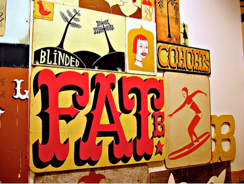


Her work was heavily influenced by American folk art which can be seen in the illustrations and colour palettes. She valued craftmanship and loved old hand-painted shop signs, something that clearly inspired her murals.
"I like things that are handmade and I like to see people's hand in the world, anywhere in the world; it doesn't matter to me where it is. And in my own work, I do everything by hand. I don't project or use anything mechanical, because even though I do spend a lot of time trying to perfect my line work and my hand, my hand will always be imperfect because it's human. And I think it's the part that's off that's interesting, that even if I'm doing really big letters and I spend a lot of time going over the line and over the line and trying to make it straight, I'll never be able to make it straight. From a distance it might look straight, but when you get close up, you can always see the line waver. And I think that's where the beauty is."
Margaret did many colaborations with other artists in the film including her husband, Barry Mcgee. She was also a grafitti artist on the freight trains, influenced by Hobo tradition, she worked under the tags 'Meta' and 'Matokie Slaughter'.
Sadly in 2001 Margaret Kilgallen died aged 33 of breast cancer just weeks after giving birth to her daughter, Asha. She was a talented and inspirational artist and I'm so pleased to have found her work. I really want to see it in the flesh and retrospectives do pop up now and again, but until then this Flickr group has a great collection of her work.
Images copyright the authors - from the Margaret Kilgallen Flickr.
https%3A%2F%2Fwww.deliciousindustries.com%2Fmargaret-kilgallen-aka-meta-matokie-slaughter
Delicious+Industries%3A+Margaret+Kilgallen+aka+META+%2F+Matokie+Slaughter
Andy Smith's Blue Inks

Big thanks to illustrator Andy Smith for sending us a copy of 'Blue Inks', his new limited edition screen printed book, we're very honored and we love it!


The 30 page book is packed with fantastic typography and illustration throughout as it, "follows the exploits of a gang of colour specific creatures" - very niche, but very funny. My favourite scene has to be the blue inks' fight with some magentas (below)!

'Blue Inks' and loads more of Andy's wonderful illustrations are available here. Also check out the work he's just completed with our friends Sell! Sell! for Fish4 here.
Images copyright Andy Smith.
https%3A%2F%2Fwww.deliciousindustries.com%2Fandy-smiths-blue-inks
Delicious+Industries%3A+Andy+Smith%26%23039%3Bs+Blue+Inks
Paul Thurlby Alphabet prints


Remember our post about illustrator Paul Thurlby and his gorgeous alphabet prints? Well Paul has been in touch to tell us the alphabet is now complete. The new prints are every bit as good as the earlier ones - more great colour combos, the same vintage/retro feel and some fun typography!
Each print is a signed and numbered limited edition of 200, and at the minute you can get 3 for the price of 2, so check out the Alphabet Shop.
Images copyright Paul Thurlby.
https%3A%2F%2Fwww.deliciousindustries.com%2Fpaul-thurlby-alphabet-prints
Delicious+Industries%3A+Paul+Thurlby+Alphabet+prints
Auto Type III


More auto type - emblems, badges and signwriting from the 1066 Cruisers, Mid-Summer Picnic yesterday. I really like the 'Futura' badge from a 1964 Ford Falcon, especially the 'F'. I'll be uploading them to the Flickr group asap.
More auto type here and here. And some automotive industry logos from the 50's here.
https%3A%2F%2Fwww.deliciousindustries.com%2Fauto-type-iii
Delicious+Industries%3A+Auto+Type+III
Seb Lester Prints


Seb originally studied graphic design at Central Saint Martin's, before specialising in typography and has created typefaces used by Dell, Intel and the New York Times. "Seb is passionate about letterforms which form the basis for his pieces. He brings letters to life with his animated illustration style and bold sense of humour." from the press release for his up and coming exhibition.
You can check out his work in person next month if you're in the Newcastle area as his new exhibition previews at the Electrik Sheep Gallery on 6 August. It should be a cracking show.
Images copyright Seb Lester.
https%3A%2F%2Fwww.deliciousindustries.com%2Fseb-lester-prints
Delicious+Industries%3A+Seb+Lester+Prints
New Andy Smith Prints

Andy Smith's newsletter hit my inbox this morning with a great selection of his new work, including some new screenprints now available on his website.
These two are my favourites, I love the giant arrow - it's brown and pink so definitely hits all the right buttons and the chicken, well who doesn't like a big - err - chicken?!

Images copyright Andy Smith.
https%3A%2F%2Fwww.deliciousindustries.com%2Fnew-andy-smith-prints
Delicious+Industries%3A+New+Andy+Smith+Prints
Auto Type II


Check out the first batch Auto Type here.
https%3A%2F%2Fwww.deliciousindustries.com%2Fauto-type-ii
Delicious+Industries%3A+Auto+Type+II
Vintage Typewriter Ribbon TIns


Thanks to Ryan at Sell! Sell! for the link to these great old Typewriter Ribbon tins - they are part of Uppercase's collection on Flickr.

They're really gorgeous items that look fantastic as a group - the graphics, typography and bold colours, just make them so interesting.
I'm sure I have some of these somewhere, I'll have to try and route them out!
Images copyright Uppercase.
https%3A%2F%2Fwww.deliciousindustries.com%2Fvintage-typewriter-ribbon-tins
Delicious+Industries%3A+Vintage+Typewriter+Ribbon+TIns
Welcome

Welcome to the Delicious Industries blog. We're an independent design studio based in Brighton, UK and this is our scrapbook packed full of design, illustration, photography & typography inspiration. Check out our work here.
Links
DELICIOUS FRIENDS
DELICIOUS FAVOURITES
- 50 Watts
- Acejet 170
- Grain Edit
- It's Nice That
- National Geographic Found
- Notcot
- Pretty Clever
- Retronaut
- So Much Pileup
- We Love Typography
- Another Mag