art direction, design + typography
Blog: Illustration
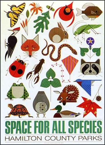
Charley Harper Federal Building Mural


I've read about the Charley Harper mural in the Federal Building Cincinnati, but had no idea it was still in existence until I saw these pics on Visualingual.
The mural illustrates American wildlife in Harper's unique style, easily recognisable even when created in mosaic tiles. In fact his style seems to really lend itself to this discipline.
It's so great to see it in such detail, so huge thanks Visualingual for going down there and then sharing your pics.
PS. Tomorrow is the last day to catch the Charley Harper exhibition at Castor + Pollux, Brighton.
Images copyright Visualingual.
Via NOTCOT.
https%3A%2F%2Fwww.deliciousindustries.com%2Fcharley-harper-federal-building-mural
Delicious+Industries%3A+Charley+Harper+Federal+Building+Mural
From the reference box # 87


#87 - British Discovery First Day Cover Stamps. Issued on 19 September 1967 this set of stamps commemorates, "four aspects of British discovery which have changed the course of modern living".
4d - Designed by Clive Abbott depicts a radar screen to pay tribute to Sir Robert Watson-Watt and his discovery and development of radar.
1/- Also designed by Abbott, celebrates Sir Alexander Fleming's discovery of penicillin and shows spores of penicillin.
1/6d - Designed by Richard Negus and Philip Sharland this stamp illustrates 2 jet engines on a VC10 aircraft to commemorate the invention of the jet engine by Sir Frank Whittle.
1/9d - Also designed by Richard Negus and Philip Sharland the final stamp in this set celebrates the work of John Logie baird and an invention we all enjoy - the television!
I always find it odd when different people design stamps in the same set as they always appear disjointed when put together with no consistency of type sizes, fonts, size of the Queens head or even overall layout/style.
Here's the First Day Cover Envelope (designed by David Gentleman) showing portraits of the inventors...


There are many more First Day Covers and stamps in the reference box - check them out here.
https%3A%2F%2Fwww.deliciousindustries.com%2Ffrom-the-reference-box-87
Delicious+Industries%3A+From+the+reference+box+%23+87
Holiday Magazine Covers


The fabulous Gono have all the covers from 1946 - 1968, many are photographic, but there are quite a few graphic ones as above - check them out here.
Holiday was a US travel magazine from 1928 - 1977, first published by the AAA (American Automobile Association) until the mid 40's when it was sold to Curtis Publishing Company who ran the magazine until 1977 when it was sold to Travel magazine who merged it with their publication to form Travel Holiday.
Via Covenger + Kester.
https%3A%2F%2Fwww.deliciousindustries.com%2Fholiday-magazine-covers
Delicious+Industries%3A+Holiday+Magazine+Covers
From the reference box # 84


#84 - New Zealand First Day of Issue stamp set, 'Family Life'. Issued in April 1981 this set of stamps depicted various activities of family life:
20c - Family life: At Play
"Participation of the whole family in some recreational activity whether it be an organised sport or a carefree game, as well as being fun, can help to develop good relationships between family members."
25c - Family life: Young and Old
"Despite the difference in age, strong feelings and bonds usually spring up between the young and old. The relationship between the grandparents and grandchildren of the family can be beneficial to both. It usually helps them to understand different values and opinions."
30c - Family life: At Home
"Reading is an enjoyable pastime and when all the family are involved it can stimulate conversation, ideas and for the younger ones, learning."
35c - Family life: At Church
"Family life revolves around permanence and sanctity, personal growth, commitment, mutual understanding and inter-dependence."
They were designed by A Derrick, Invercargill and in the bottom right, "Each of the four stamps incorporated the Maori word "Whanau", which is universally known in Maoridom to mean the extended family".
I can't find any information about an illustrator so I assume derrick did the wonderful illustrations. I like the negative use of the white space to create the trees, lamp, bird cage and statue amongst bright backgrounds and really like the thick bold outlines that surround the family unit - very subtle emphasis of the theme.
There are lots more fabulous stamps in our reference box, have a rummage here.
Quotes taken from the New Zealand Post.
https%3A%2F%2Fwww.deliciousindustries.com%2Ffrom-the-reference-box-84
Delicious+Industries%3A+From+the+reference+box+%23+84
Blisters Blackout Submission Call

Print Club are now accepting submissions for their December show, Blisters Blackout - "40 Illustrators. 40 Edition and hand signed prints. 40 Pounds each".
All entries must be new work, and for the 'blackout' must have an element of glow-in-the-dark. Throughout opening night the exhibition space will be blacked-out revealing the glowing bits of the designs.
So get your skates on, the closing date for submissions is 30 September 2010 after which time 50 posters will be selected for the show.
For more information and to see work from previous Blisters shows visit Print Club London.
https%3A%2F%2Fwww.deliciousindustries.com%2Fblisters-blackout-submission-call
Delicious+Industries%3A+Blisters+Blackout+Submission+Call
Roman Cieślewicz Retrospective


"Cieślewicz was - alongside Fernando Arrabal and Alejandro Jodorowsky - a member of Panique, the 'last' surrealist group in France. At the same time he was a brilliant art director at Elle, and a contributor to Vogue. Remarkably prolific, he also worked closely with figures from the worlds of advertising and fashion including Guy Bourdin and Helmut Newton.
Extraordinarily talented as an image-maker, Cieślewicz’s tools were not the pen or the brush but the scalpel and scissors. Working with collage, he produced compelling and original images by reworking familiar icons such Che Guevara or Mona Lisa. “I always go for the maximum picture and the maximum information. You need to stimulate imagination to the maximum” - he once said in an interview."
The exhibition will include 150 pieces of Cieślewicz's diverse work including the iconic magazine covers created for Opus (above top & middle) and the poster he designed for Hitchcock's Vertigo (above bottom). The collections on display are from the National Museum in Poznan, the Museum Art in Łódź and the private collection of Cezary Pieczyński.
See other posts about Roman Cieślewicz here and here.
Images copyright Roman Cieślewicz from 'Roman Cieślewicz: Master of Graphic Design' by Margo Rouard-Snowman. Published by Thames & Hudson Ltd. London, 1993.
Quotation from the Polish Cultural Institute.
https%3A%2F%2Fwww.deliciousindustries.com%2Froman-cielewicz-retrospective
Delicious+Industries%3A+Roman+Cie%C5%9Blewicz+Retrospective
Charley Harper at Castor + Pollux

The Charley Harper private view at Castor + Pollux on Friday night was great, the vintage prints looked fantastic framed and mounted up together and I noticed lots of red dots, so if you want one I would get down there sharpish. We are now the proud owners of the Trumpeter Swan (above) which I absolutely love and can't wait for the exhibition to end so we can bring it home (huge thanks Mike)! From memory the following were still available:


As well as the vintage prints on display they also have a selection of limited edition giclee prints and few of the posters Harper designed towards the end of his career (below) which are huge and great value for money at £35-45 unframed or mounted on board for an additional £30.


Congrats to everyone at Castor + Pollux for putting on such a great show!
Images copyright the Estate of Charley Harper.
https%3A%2F%2Fwww.deliciousindustries.com%2Fcharley-harper-at-castor-pollux
Delicious+Industries%3A+Charley+Harper+at+Castor+%2B+Pollux
Huge news for UK Charley Harper fans…

Our friends at Castor + Pollux, Brighton have just announced the first UK exhibition of American illustrator Charley Harper's outstanding work. To say we're excited is an understatement!
Fans of Harper will be familiar with his work for Ford Times and know that many of his illustrations were also offered to readers as screen prints.
Well, this exhibition has 22 of the original Ford Times screen prints from the 50's and 60's hand-printed by the Harpers in their basement, along with some later prints from the 70's and 80's printed by the studio.
Last week I was fortunate enough to have a sneaky peak at the work and I can report it's even more amazing in the flesh than it is in any book.
The private view is on Friday 2 July and the exhibition runs from 3 July to 5 September 2010, so there is plenty of time to plan a trip to the seaside (Castor + Pollux is right on the seafront).
Read more about Charley Harper here and here.
https%3A%2F%2Fwww.deliciousindustries.com%2Fhuge-news-for-uk-charley-harper-fans
Delicious+Industries%3A+Huge+news+for+UK+Charley+Harper+fans%26%238230%3B
From the reference box # 77


#77 - More matchbooks! Here's a selection of 70's and early 80's matchbooks I managed to get my hands on last week at an autojumble?!
The typography is great, especially on the BEA and Berni logos, but most of all I'm loving the thick black outline of the Wesson illustrations and the delicate skier illustrations on the Wyoming one.
This collection is getting pretty big these days - check out more here, here and here.
https%3A%2F%2Fwww.deliciousindustries.com%2Ffrom-the-reference-box-77
Delicious+Industries%3A+From+the+reference+box+%23+77
Get your Skates on!


https%3A%2F%2Fwww.deliciousindustries.com%2Fget-your-skates-on
Delicious+Industries%3A+Get+your+Skates+on%21
More Country Fair Magazines


Remember the Country Fair Magazines I posted about last year, well this weekend I was lucky enough to find a few more!
These new issues also have beautifully illustrated and graphic covers. There are four Jonny Hanna covers (October 1956, July 1957, November 1957 and June 1958) and one by children's book illustrator, John Lobban (the orange bat one - April 1958).
I can't wait to find more of these - fingers crossed I'll be lucky again soon.
If you liked these you may also like my collection of Which? Magazine covers and Do It Yourself Annuals.
https%3A%2F%2Fwww.deliciousindustries.com%2Fmore-country-fair-magazines
Delicious+Industries%3A+More+Country+Fair+Magazines
Paul Catherall at Castor + Pollux


We're big fans of his work and can't wait to see the exhibition which includes a print of Brighton's infamous Embassy Court building (top), which is available at the special price of £250 (unframed) when ordered before the 15 May or bought at the private view evening.
The private view on the evening of Friday 14 May kicks off the exhibition which will then run from 15 May - 20 June.
See more work from Paul Catherall here.
Images copyright Paul Catherall, taken from Castor + Pollux.
https%3A%2F%2Fwww.deliciousindustries.com%2Fpaul-catherall-at-castor-pollux
Delicious+Industries%3A+Paul+Catherall+at+Castor+%2B+Pollux
Andy Smith Newspaper

I was very excited last week when the postie delivered a big white envelope with an Andy Smith illustration on the back (even though it had been screwed up to fit it in the postbox!). It was his new promotional newspaper created by the Newspaper Club in an edition of 500!
The paper is a collection of 12 posters created originally by Andy as silkscreen prints. Some are old favourites and a few are new (to me anyway), but they're all fantastic. I especially love the cover (above) with the fading effect.


Thanks Andy!
https%3A%2F%2Fwww.deliciousindustries.com%2Fandy-smith-newspaper
Delicious+Industries%3A+Andy+Smith+Newspaper
From the reference box #70


#70 - Commemorative, sailing themed stamps from the UK designed by Andrew Restall MISA and released on June 11 1975
These bold, colourful stamps illustrate Sailing Dinghies (7p), Racing Keel Boats (8p), Cruising Yachts (10p) and Multihulls (12p).
Below is the First Day Cover that my set came on...

See more Andrew Restall designed stamps from the reference box here, here and here.
https%3A%2F%2Fwww.deliciousindustries.com%2Ffrom-the-reference-box-70
Delicious+Industries%3A+From+the+reference+box+%2370
From the reference box # 68


#68 - set of 4 stamps celebrating 50 years of the BBC (1922 - 1972).
Designed by David Gentleman and released on 13 September 1972, these stamps have great illustrations of equipment significant in the history of broadcasting; 3p - Microphones, 5p - Horn Loudspeaker, 7 1/2p - TV Camera and 9p - Oscillator and spark transmitter (Marconi/Kemp experiments 1897).
Here are the first day covers for each stamp, which are also pretty cool...


See more David Gentleman designed stamps from the reference box here.
https%3A%2F%2Fwww.deliciousindustries.com%2Ffrom-the-reference-box-68
Delicious+Industries%3A+From+the+reference+box+%23+68
Welcome

Welcome to the Delicious Industries blog. We're an independent design studio based in Brighton, UK and this is our scrapbook packed full of design, illustration, photography & typography inspiration. Check out our work here.
Links
DELICIOUS FRIENDS
DELICIOUS FAVOURITES
- 50 Watts
- Acejet 170
- Grain Edit
- It's Nice That
- National Geographic Found
- Notcot
- Pretty Clever
- Retronaut
- So Much Pileup
- We Love Typography
- Another Mag