art direction, design + typography
Blog: Illustration
Printing cards for AT Open House 2012


We're going to be part of the AT Open House again in May this year, so every spare minute is being spent designing and printing, cards and notebook covers. Such great fun!
They'll soon be available on our Etsy store too, so keep checking!
https%3A%2F%2Fwww.deliciousindustries.com%2Fprinting-cards-for-at-open-house-2012
Delicious+Industries%3A+Printing+cards+for+AT+Open+House+2012
Blisters - The Directors Cut

As usual the 40 pieces selected from 40 artists will be from a range of 'established and emerging illustrators, designers and street artists', in editions of 40 and sold for £40!
Anyone can enter and the deadline for entries is Sunday 10 June 2012.
For those interested, here's the brief:
Submit an alternative movie poster in your own style inspired by your favorite film!
The catch is, you cannot use the title of the film at all.
Use of other text is allowed of course but it should stand alone as an image, scene or typographic piece, it doesn’t have to be an advertisement for the film!
Poster size B2 (700x500mm) and to be screenprinted!
More information here.
https%3A%2F%2Fwww.deliciousindustries.com%2Fblisters-the-directors-cut
Delicious+Industries%3A+Blisters+-+The+Directors+Cut
Henri's walk to Paris by Saul Bass & Leonore Klein

Well, how could I not have recognised the work of Saul Bass (don't worry I am truly ashamed!). It turns out that this is a pic of the cover of an original copy of the only children's book he ever designed - 'Henri's walk to Paris'. A book that he designed with Leonore Klein in 1962 and that has been out of print for many years until now.
"Henri’s Walk to Paris is the story of a young boy who lives in Reboul, France, who dreams of going to Paris. One day, after reading a book about Paris, he decides to pack a lunch and head for the city."


As of last week this gorgeous little book is back on the shelves and available here.
Via Brain Pickings.
Images (apart from the top one) from Brain Pickings.
https%3A%2F%2Fwww.deliciousindustries.com%2Fhenris-walk-to-paris-by-saul-bass-leonore-klein
Delicious+Industries%3A+Henri%26%23039%3Bs+walk+to+Paris+by+Saul+Bass+%26amp%3B+Leonore+Klein
The official Roald Dahl stamps – Gloriumptiously collectable


The set of 6 stamps feature original illustrations of some of Dahl's best-loved characters; Charlie and the Chocolate Factory, Fantastic Mr Fox, James and the Giant Peach, Matilda, The Twits and The Witches. Buy yours here!
https%3A%2F%2Fwww.deliciousindustries.com%2Fthe-official-roald-dahl-stamps-gloriumptiously-collectable
Delicious+Industries%3A+The+official+Roald+Dahl+stamps+%E2%80%93+Gloriumptiously+collectable
EE Chrisp letterpress printers


https%3A%2F%2Fwww.deliciousindustries.com%2Fee-chrisp-letterpress-printers
Delicious+Industries%3A+EE+Chrisp+letterpress+printers
From the reference box # 118


After some research I was fascinated to discover that Skansen is a living open-air museum in Djurgården, Stockholm, Sweden - the first in the wolrd in fact!
Founded by Artur Hazelius in 1891 as the outdoor annex to his Nordiska Museet (Nordic Museum), Skansen was the culmination of years of collecting and saving ethographical relics. In 1872 he had realised just how quickly life in Sweden was changing and set about " collect clothing, household utensils, furniture and hand-tools from the old farming culture: everything that needed to be preserved for posterity".
"At the beginning of the 1870s, three million of Sweden’s population of just over four million people still lived in the countryside. But country life had changed. The number of independent farmers had declined and the ranks of the landless had grown. The increase in population created a growing body of tenant cottagers, servants to the gentry and indentured labourers. Land reforms that destroyed villages and re-allocated the fields transformed the way of life in the countryside as well as its buildings. Agriculture became mechanized, industrial products did away with crafts and new means of communication opened up more efficient ways of distributing goods."
"The landless classes left their homes to seek work on the railways, in the shipyards and the factories and in the sawmills of northern Sweden. Sweden developed into an urban society. Crop failures at the end of the 1860s caused more than 100 000 Swedes to emigrate to America. This wave of emigration reached a peak in the 1880s when 325 000 Swedes left for America and a further 52 000 emigrated to other countries."
It wasn't enough for Hazelius to show static exhibitions, he wanted people to experience complete environments; the everyday life and sounds of the old Swedish culture, "fully furnished houses occupied by people wearing period costume surrounded by their domestic animals in a natural landscape".
Skansen is still a popular tourist attraction today, though I think it will look a bit different to how it did in 1961 - here's the full fold-out map from back then in all it's glory...

Unfortunately I couldn't find out who the illustrator was, there is the word Järk in the map border, but that's the only clue. If you do have any ideas as to who it might have been, please let me know.
https%3A%2F%2Fwww.deliciousindustries.com%2Ffrom-the-reference-box-118
Delicious+Industries%3A+From+the+reference+box+%23+118
Rob Ryan at Castor + Pollux

"A Sky Full of Kindness’ which has been written and illustrated by Rob using his intricate and beautiful paper cuts, telling the story of two birds who are preparing for their egg to hatch."
The exhibition runs until the 5 December. It's a collection of new prints and hand-cut illustrations from the book, along with a selection of cards, laser cuts, plates, bunting, books and mugs always available at Castor + Pollux. Great for some early Christmas shopping!
Don't worry if you can't get down to Brighton though, there's a great selection of his work available from their online store.
https%3A%2F%2Fwww.deliciousindustries.com%2Frob-ryan-at-castor-pollux1
Delicious+Industries%3A+Rob+Ryan+at+Castor+%2B+Pollux
Lo Cole at Castor + Pollux

Lo Cole is a freelance illustrator and print maker based in Gloucestershire with a career already spanning 20 years and a very impressive client list including; Vogue, The Guardian, Greenpeace, The Royal National Theatre, Harper Collins and Royal Mail Stamps.
All his pieces are vibrant and energetic, but some are simple and graphic whilst others are wild and abstract. It's the more graphic prints that do it for me though, especially the bird one above with the lovely little pink and red birds.


Images copyright Lo Cole.
https%3A%2F%2Fwww.deliciousindustries.com%2Flo-cole-at-castor-pollux
Delicious+Industries%3A+Lo+Cole+at+Castor+%2B+Pollux
Smells I Like by Gordon Stowell


Illustrator and cartoonist Gordon Stowell sadly died in 2003. He sold his first cartoon to a newspaper in 1942 aged only 14. Throughout his very long career he wrote and illustrated many children's books (including the one above published by AR Mowbray & Co Ltd. in 1969) and had his cartoons published regularly in the likes of Private Eye and Punch magazines - he believed, "cartoons could put over serious subjects".
There are 8 more books in this range, so the search is on - not sure how many of them I'll be able to pick up for 20p though!
https%3A%2F%2Fwww.deliciousindustries.com%2Fsmells-i-like-by-gordon-stowell
Delicious+Industries%3A+Smells+I+Like+by+Gordon+Stowell
Vintage bread wrappers


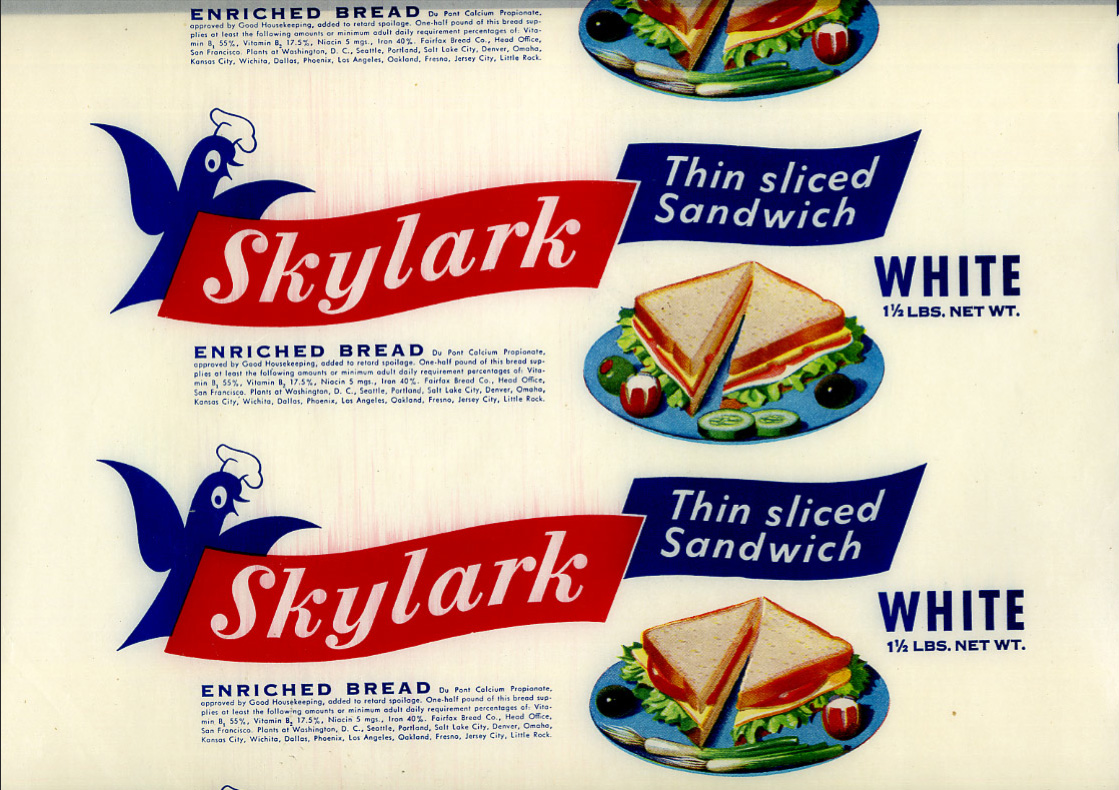


Bread used to be packaged in a waxed paper and sealed at either end with a sticker (in fact in the UK some brands still use the waxed paper, but heat sealed with a glue at the ends instead of with stickers).
These fine examples are waxed, bread wrappers from the 40's & 50's. I think the Victory Vitality Bread is my favourite because if it's simplicity, although the Skylark is giving it a run for it's money (it's that little chef hat on the skylark graphic!).
Se more of the collection here.
Via the How to be a Retronaut.
https%3A%2F%2Fwww.deliciousindustries.com%2Fvintage-bread-wrappers
Delicious+Industries%3A+Vintage+bread+wrappers
More Country Fair covers


Remember our post about Country Fair: The monthly journal of the open air? Well we've just uploaded lots more of the gorgeously illustrated 50's & 60's covers to Flickr.
As it's July 1st, the covers above are from July issues only, but you can see the full collection here.
If you like these it's quite likely you'll like these and these!
https%3A%2F%2Fwww.deliciousindustries.com%2Fmore-country-fair-covers
Delicious+Industries%3A+More+Country+Fair+covers
Daphne Padden Original Sketches


They discovered she did quite a lot of packaging design in the 70's, mainly for M&S (or St Michael as it was back then) and kept the original design sketches as well as the finished packaging which is really great to see.
I love seeing the original sketches more than the finished design - they have so much more character. So thanks Quad Royal for sharing your bounty!
Quad Royal have been researching and championing Daphne Padden's design work for some time, so there's lots more to read see here and here.
Images copyright Quad Royal.
https%3A%2F%2Fwww.deliciousindustries.com%2Fdaphne-padden-original-sketches
Delicious+Industries%3A+Daphne+Padden+Original+Sketches
Sunny Side Up

The exhibition will include 12 new large, hand-screenprints featuring "bold statements, strange visitors, warnings from gurus, the thoughts of CaptainScott and other random themes", new 3d arrows, moose heads, totes and stickers all in the distinctive Andy Smith illustration and lettering style.
All the artwork in the show will be available online too, so don't worry if like me you can't make it over to Bristol for the show.
For more info visit Soma, or see teaser images of Andy's new work here.
Image copyright Andy Smith.
https%3A%2F%2Fwww.deliciousindustries.com%2Fsunny-side-up
Delicious+Industries%3A+Sunny+Side+Up
From the reference box # 109

#109 - Fly BEA Map of Copenhagen. I picked up this little gem at the weekend. It was the detailed cover illustration that first caught my eye - it reminded me of the E-boy cityscapes.
The leaflet was a complimentary guide given to passengers of BEA when traveling to Denmark's capital city in 1964. It folds out to a large map on one side and is packed with tourist information on the other.
It opens portrait, to a gorgeously graphic map and suggested places to see from 'Kongens Nytorv (The King's New Market) to Tivoli...

Or opens landscape to reveal a 'Railway Skeleton Map of City, Suburban and Districts Services with Connections'. I love the 'S' graphic with the wings and crown...

and on the back has a handy currency guide...

BEA operated domestic and European flights from airports across the UK from 1946 to 1974 when they merged with their parent company BOAC (British overseas Airways Corporation), Cambrian Airways and Northeast Airlines to become British Airways.
Whilst researching BEA, I found some great old adverts from the late 50's and 60's here and also a selection of timetables from the same period here.
https%3A%2F%2Fwww.deliciousindustries.com%2Ffrom-the-reference-box-109
Delicious+Industries%3A+From+the+reference+box+%23+109
Paul Thurlby's Alphabet Book


Well, his illustrated Alphabet has taken on a life of it's own since we last posted. The lovely letters are now available as signed/numbered, limited edition Giclee prints, as greeting cards and have just been made into a children's ABC book (below)!

Pre-order your copy here for only £8.69!
Images copyright Paul Thurlby.
https%3A%2F%2Fwww.deliciousindustries.com%2Fpaul-thurlbys-alphabet-book
Delicious+Industries%3A+Paul+Thurlby%26%23039%3Bs+Alphabet+Book
Welcome

Welcome to the Delicious Industries blog. We're an independent design studio based in Brighton, UK and this is our scrapbook packed full of design, illustration, photography & typography inspiration. Check out our work here.
Links
DELICIOUS FRIENDS
DELICIOUS FAVOURITES
- 50 Watts
- Acejet 170
- Grain Edit
- It's Nice That
- National Geographic Found
- Notcot
- Pretty Clever
- Retronaut
- So Much Pileup
- We Love Typography
- Another Mag