art direction, design + typography
Blog: Ephemera
From the reference box #100!!

#100 - Make Do and Mend, WWII booklet. I promised something special for number 100, and I don't think this will disappoint. It's an original Board of Trade, booklet published in 1943 as part of their 'Make Do and Mend' campaign.
The Board of Trade produced many leaflets and booklets during WWII. This one was specifically designed to:
• Keep clothes looking trim as long as they have to last
• Renovate children's outgrown clothes so cleverly that none is ever wasted
• Turn every scrap of good material you possess to advantage
• Keep your household linen in good repair
• Make do with things you already have instead of buying new
Clothes rationing was introduced in June 1941 and originally allocated 66 coupons per person. By 1943 the number of coupons had been reduced to 60 per person and emphasis put on the maintenance and care of clothing and household linens - cue the Make Do and Mend campaign.
There are 29 illustrations throughout the booklet including these lovely section headings...


I was lucky enough to pick up this original booklet for 50p!! But if you would like one, the Ministry of Information have published reproductions of all their wartime information publications in the, 'Historic Booklet Series'. This one can be purchased here. Also there's a great article about clothing rations during WWII here if you would like to know more.
https%3A%2F%2Fwww.deliciousindustries.com%2Ffrom-the-reference-box-100
Delicious+Industries%3A+From+the+reference+box+%23100%21%21
P&O Menus & Entertainment Programmes

P&O Entertainment Programme, Dorrit Dekk.

P&O Entertainment Programme, Dorrit Dekk. 1962.

P&O Entertainment Programme, Dorrit Dekk. 1962.

P&O Gala Menu, Daphne Padden. 1962.

P&O Entertainment Programme, Daphne Padden. Circa 1950's.

P&O Gala Menu, Daphne Padden. 1958.

P&O Entertainment Programme, Daphne Padden. 1959.

P&O Menu/Entertainment Programme cover, Daphne Padden.

P&O Gala Menu, Daphne Padden. 1956.
Here's a bit of inspiration for a dreary, wet Wednesday morning.
I first saw a P&O Entertainment Programme designed by Dorrit Dekk over on Quad Royal and was instantly drawn to the bright, graphic illustrations/collages.
On further investigation I found Bonito Club's Flickr and yet more fabulous P&O covers (Menus and Entertainment Programmes) from the late 50's and early 60's. All the ones I've seen were designed by either Daphne Padden or Dorrit Dekk, but I'm not sure if they created all the covers during this period.
There must be hundreds more in existence, as it seems the designs changed every year and each P&O liner had different designs. I'll have to keep my eye out for some of these on Ebay!
If you like this post, chances are you'll also like these:
Gebrauchsgraphik Magazine
Modern Packaging
Holiday Magazine
Country Fair Magazine
Which? Magazine
Mac Fisheries
Images copyright Quad Royal and Bonito Club.
https%3A%2F%2Fwww.deliciousindustries.com%2Fpo-menus-entertainment-programmes
Delicious+Industries%3A+P%26amp%3BO+Menus+%26amp%3B+Entertainment+Programmes
Don't drain my anti-freeze!

"Don't drain my anti-freeze it protects my engine, winter and summer"
I snapped this Shell sticker last Summer - the cute little chappie was on the front screen of a very old car and by the looks of it, he'd been there for quite some time.
If found type/old signage is your thing, check out previous posts here.
https%3A%2F%2Fwww.deliciousindustries.com%2Fdont-drain-my-anti-freeze
Delicious+Industries%3A+Don%26%23039%3Bt+drain+my+anti-freeze%21
Mmmmmm cheese…


I love a collection, and one that combines cheese and design just has to be worth a post! These wonderful cheese labels circa 1957 are part of a collection large found in a scrapbook on Ebay and featured in Culture Magazine.
Read the full story over on Design Observer.
Images copyright Culture Magazine.
https%3A%2F%2Fwww.deliciousindustries.com%2Fmmmmmm-cheese
Delicious+Industries%3A+Mmmmmm+cheese%26%238230%3B
From the reference box # 97

#97 - Hoffmann's die-cut advertising cat, circa 1930's. This cat is way too cute to be put away in the reference box so he lives on my desk. His front legs pull forwards so that he can stand up, but he's very small for a point of sale and he has a card around his neck that reads, "HOFFMANN'S Reis-Stärke mit der katze" ("Hoffmann's rice starch, with the cat"). I did read that he's a bookmark, and he would do the job well, but I'm not convinced that was his original purpose.
Hoffmann's were a German starch factory just outside Salzuflen founded in 1850. They're cat logo (below) designed by illustrator Flinzer Fedor became a registered trademark in 1876. The cat was used as it portrays cleanliness. Hoffmann's really loved the cat as an icon and it's said on their 100th anniversary they decorated a cat on a pedestal in the factory grounds and in 1988 a giant cat was paraded through Salzuflen to celebrate the 500th anniversary of the freedom of the city. A 2 metre high statue of the cat was also taken to events during the 1930's!
There's lots more vintage advertising and packaging in the Reference box - check it out here.
https%3A%2F%2Fwww.deliciousindustries.com%2Ffrom-the-reference-box-97
Delicious+Industries%3A+From+the+reference+box+%23+97
From the reference box #95

#95 - Vintage Ryvita paper bag. I'm guessing that these bags were used to buy individual Ryvitas before they were available in packs.
It's definitely post World War II, probably early 50's as it states, 'Made in Poole, Dorset' - the new factory location after the original Birmingham one was bombed during the war.
I love the print quality, yes it is a bit blobby in places, but I like that and I also really like the shopping list element on the back. It's interesting to see vintage packaging encouraging re-cycling and re-use, almost like we've done a full circle!
Don't forget to have a root through our other reference box items, you never know what you might find!
https%3A%2F%2Fwww.deliciousindustries.com%2Ffrom-the-reference-box-95
Delicious+Industries%3A+From+the+reference+box+%2395
From the reference box # 94


#94 - More vintage Christmas cards! A seasonal treat from the reference box today, Christmas cards from the 50's and early 60's - more from the great scrapbook collection I posted about last year.
I'm immediately attracted to the big bold, bright ones like the bells (top) but some of the subtler designs have such intricate detail it's hard to pick a favourite. For example, the second one down with the robins, has a tiny 1952 calendar under the post box and the last one is covered in tiny embossed snowflakes. Print finishing like that would cost a fortune these days!
https%3A%2F%2Fwww.deliciousindustries.com%2Ffrom-the-reference-box-94
Delicious+Industries%3A+From+the+reference+box+%23+94
From the reference box # 93

#93 - Vintage IGARD Lens packaging. I love combination of the large red 'Z' and the dark olive green on this packaging. I think it's from the late 50's/early 60's.
IGARD was a division of COIL (Combined Optical Industries Ltd.), manufacturers of low vision products established in 1936 by Arthur Kingston and still in existence. Throughout the 40's and 50's they were world leaders in plastic lenses, "The company pioneered techniques in the precision moulding of plastic optics using injection and compression moulding".
The light-weight, shatterproof plastic created by COIL was the result of UK developments in acrylic (polymethyl-methacrylate) for aircraft windshields before and during WWII.
See more fabulous items in our reference box here.
https%3A%2F%2Fwww.deliciousindustries.com%2Ffrom-the-reference-box-93
Delicious+Industries%3A+From+the+reference+box+%23+93
Vintage coupons
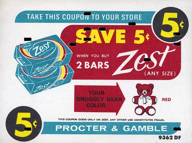


This is what I love about blogs - turning the computer on in morning and being greeted with gorgeous images. These fabulous 50's and 60's coupons are from Roadsidepictures 'Vintage Coupon' Flickr set. Such a great collection and just the inspiration I need on a miserable Monday morning!
Via the wonderful Words & Eggs.
https%3A%2F%2Fwww.deliciousindustries.com%2Fvintage-coupons
Delicious+Industries%3A+Vintage+coupons
From the reference box #92

#92 - Vintage paper dice. I love this new addition to the reference box. I think it's from the late 40's or early 50's when there was a shortage of materials.
I'm sure I have another one somewhere, but I can't find it - I'll have to have a root around in the reference box myself and see if it turns up!
https%3A%2F%2Fwww.deliciousindustries.com%2Ffrom-the-reference-box-92
Delicious+Industries%3A+From+the+reference+box+%2392
Citroen Ephemera


Really loving these 60's Citroen promotional booklets designed by Parisian studio, Delpire over on Grain Edit. They were created by the father of Francois-Charles (iconomaque) who worked at the studio in the 60's and were discovered whilst he was sorting through his father's studio.
What a great bit of ephemera to start the day with!
Via Sell! Sell!
Images copyright iconomaque.
https%3A%2F%2Fwww.deliciousindustries.com%2Fcitroen-ephemera
Delicious+Industries%3A+Citroen+Ephemera
From the reference box #91


#91 - Vintage fasteners. I love these 50's Snap Fastener and Hooks & Eyes cards from "World Famed", Newey's - "If it fastens Newey's make it!".
They're only small cards, but they have some great type...

and some lovely print...

Think I feel another collection coming on!
There are 90 more wonderful items tucked away in our reference box - take a look here.
https%3A%2F%2Fwww.deliciousindustries.com%2Ffrom-the-reference-box-91
Delicious+Industries%3A+From+the+reference+box+%2391
From the reference box #90


#90 - Vintage throat lozenges circa 1950. I bought a few of these packages at a boot sale recently and have since found out a bit about the companies. Bradosol Antiseptic Lozenges are still available today, but these sample packs (above) are from when they were first introduced to the market in the early 50's by CIBA Laboratories, Horsham, England.
CIBA (Company for Chemistry Industry Basel or Gesellschaft für Chemische Industrie Basel) was a Swiss company started in the 1800's that first opened factories in the UK in 1911. It merged with Geigy in 1970 to create Ciba-Geigy Ltd and in 1996 they merged with Sandoz to form the pharmaceutical giant we know today as Novartis.
Here's an information booklet selling Bradosol, "to the Dental Profession".


I also found a sample/specimen pack of Collozets mouth and throat lozenges (below), "Manufactured in England by The Crookes Laboratories Limited, Park Royal, London".


I can't find out anything about Crookes Laboratories, but I did find this advert for Collozets from the late 50's...

If you want to see more delicious packaging and ephemera have a root around here.
https%3A%2F%2Fwww.deliciousindustries.com%2Ffrom-the-reference-box-90
Delicious+Industries%3A+From+the+reference+box+%2390
SR692: Swissair - The Ultimate Fansite


I can't get enough of all the wonderful Swissair design and print on SR692: Swissair - The Ultimate Fansite. They have a massive collection of Swissair printed ephemera including posters, tickets, calenders, publications, postcards, annual reports, time tables and route maps, as well as a very informative history of the brand and logo.
Above are a selection of the more graphic route map and time table covers. They're all really fantastic, but my favourites are the ones using the Reudi Bircher designed plane graphic logo of the 50's and 60's.
Huge thanks to Darren for sending me a link to Wanken, which led me to this great site.
Images copyright SR692.
https%3A%2F%2Fwww.deliciousindustries.com%2Fsr692-swissair-the-ultimate-fansite
Delicious+Industries%3A+SR692%3A+Swissair+-+The+Ultimate+Fansite
From the reference box #89


#89 - Philips 'Philishave' instruction booklet. Such a great little 2 colour booklet and as you would expect from a Philips instruction booklet, the design is functional, clean and simple. For such a tiny booklet there are loads of illustrations and photos too, but I bought it purely for the arrows on the cover!
I'm guessing it's circa 1960 - according to the Philips website, the 'Philishave' shaver was first introduced in the 50's and as this one has new 'floating head' technology I would think it came slightly later.
For more random ephemera, have root around our reference box here.
https%3A%2F%2Fwww.deliciousindustries.com%2Ffrom-the-reference-box-89
Delicious+Industries%3A+From+the+reference+box+%2389
Welcome

Welcome to the Delicious Industries blog. We're an independent design studio based in Brighton, UK and this is our scrapbook packed full of design, illustration, photography & typography inspiration. Check out our work here.
Links
DELICIOUS FRIENDS
DELICIOUS FAVOURITES
- 50 Watts
- Acejet 170
- Grain Edit
- It's Nice That
- National Geographic Found
- Notcot
- Pretty Clever
- Retronaut
- So Much Pileup
- We Love Typography
- Another Mag