Blog: Ephemera
From the reference box # 119
#119 - Vintage meat cuts leaflet from, 'the most extensive - Curers of Bacon & Hams in Europe', Denny's. I'm guessing here, but I think it dates from the mid 50's. The cuts of meat are really well illustrated and they're all number/letter coded so you can cross reference which part of the pig each cut comes from.
Henry Denny & Sons Ltd. were an Irish meat curing company started in 1820 in Waterford who expanded during the late 1800's opening pork processing plants in Denmark, Germany and the US. They are also credited for patenting many production methods for bacon and helping the development of the Danish bacon industry.
This leaflet was used to advertise local butchers who stocked their meat. 'Denny's Star brand' with it's trademark star graphic (seen on the front of this leaflet - top) was their brand established purely for the UK market.
According to Wikipedia "Denny’s sausages receive a mention in James Joyce’s Ulysses - ‘And a pound and a half of, Denny’s sausages…The ferreteyed porkbutcher folded the sausages he had snipped off with blotchy fingers, sausage pink’ and the company also claims to have invented the skinless sausage in 1941".
For more vintage ephemera and paper goodies, have a root through the rest of the reference box.
https%3A%2F%2Fwww.deliciousindustries.com%2Ffrom-the-reference-box-119
Delicious+Industries%3A+From+the+reference+box+%23+119
Vintage Thanksgiving Parade Balloons
Tomorrow the 85th Annual Macy's Thanksgiving Parade will work it's way through the streets of Manhattan and what better way to celebrate (if you can't actually be there) than to look through these vintage photos of the giant parade balloons.
Happy Thanksgiving my American friends - have a great day tomorrow!
Images copyright Macy's.
Via Buzzfeed.
https%3A%2F%2Fwww.deliciousindustries.com%2Fvintage-thanksgiving-parade-balloons
Delicious+Industries%3A+Vintage+Thanksgiving+Parade+Balloons
From the reference box # 118
#118 - 1961 Karta över Skansen (Map of Skansen). This beautifully illustrated map is one of my favourites. I bought it purely for the folk style illustrations and had no idea what or where Skansen was.
After some research I was fascinated to discover that Skansen is a living open-air museum in Djurgården, Stockholm, Sweden - the first in the wolrd in fact!
Founded by Artur Hazelius in 1891 as the outdoor annex to his Nordiska Museet (Nordic Museum), Skansen was the culmination of years of collecting and saving ethographical relics. In 1872 he had realised just how quickly life in Sweden was changing and set about " collect clothing, household utensils, furniture and hand-tools from the old farming culture: everything that needed to be preserved for posterity".
"At the beginning of the 1870s, three million of Sweden’s population of just over four million people still lived in the countryside. But country life had changed. The number of independent farmers had declined and the ranks of the landless had grown. The increase in population created a growing body of tenant cottagers, servants to the gentry and indentured labourers. Land reforms that destroyed villages and re-allocated the fields transformed the way of life in the countryside as well as its buildings. Agriculture became mechanized, industrial products did away with crafts and new means of communication opened up more efficient ways of distributing goods."
"The landless classes left their homes to seek work on the railways, in the shipyards and the factories and in the sawmills of northern Sweden. Sweden developed into an urban society. Crop failures at the end of the 1860s caused more than 100 000 Swedes to emigrate to America. This wave of emigration reached a peak in the 1880s when 325 000 Swedes left for America and a further 52 000 emigrated to other countries."
It wasn't enough for Hazelius to show static exhibitions, he wanted people to experience complete environments; the everyday life and sounds of the old Swedish culture, "fully furnished houses occupied by people wearing period costume surrounded by their domestic animals in a natural landscape".
Skansen is still a popular tourist attraction today, though I think it will look a bit different to how it did in 1961 - here's the full fold-out map from back then in all it's glory...
Unfortunately I couldn't find out who the illustrator was, there is the word Järk in the map border, but that's the only clue. If you do have any ideas as to who it might have been, please let me know.
https%3A%2F%2Fwww.deliciousindustries.com%2Ffrom-the-reference-box-118
Delicious+Industries%3A+From+the+reference+box+%23+118
From the reference box #117
#117 - French Carte-de-Visite (vintage photographic studio cards) from the early 1900's. They're my first European cards and it's amazing how similar they are to the UK ones I have.
As always the lettering and design is delicate and beautiful, but something I haven't seen before is a red background. It's now my favourite card, the red and gold really adds a touch of luxury.
Find out more about Carte-de-Visite here and see more of my collection here.
https%3A%2F%2Fwww.deliciousindustries.com%2Ffrom-the-reference-box-117
Delicious+Industries%3A+From+the+reference+box+%23117
United Nations Postage Stamps
These gorgeous UN postage stamps are my favourites from Aqua Velvet's post, 'United Nations Postage Stamps - Part 1' showcasing some of their collection. I love the bright colours and bold graphics, especially the big silver arrow on the one above. Really looking froward to seeing part 2!
Images copyright Aqua Velvet.
Via Notcot.
https%3A%2F%2Fwww.deliciousindustries.com%2Funited-nations-postage-stamps
Delicious+Industries%3A+United+Nations+Postage+Stamps
From the reference box # 114
#114 - Vintage cotton cards. Some new additions to my sewing ephemera collection - really love the little Pringle card and the colour of the wool!
See more reference box goodies here.
https%3A%2F%2Fwww.deliciousindustries.com%2Ffrom-the-reference-box-114
Delicious+Industries%3A+From+the+reference+box+%23+114
From the reference box # 113
The two above are new additions; a complimentary Washington DC Map and Visitor's Guide from Exxon (the parent company of Esso & Mobil), 1977 (left) and a complimentary Arizona - New Mexico Tourgide Map from Gulf, 1965 (right).
The Gulf one also has a map of the United States on the reverse with little crosses and notes in all the states the original owner had visited - I love details like this on old ephemera!
See more vintage maps and ephemera here.
https%3A%2F%2Fwww.deliciousindustries.com%2Ffrom-the-reference-box-113
Delicious+Industries%3A+From+the+reference+box+%23+113
From the reference box #110
#110 - Printing Ephemera circa, 1965. I came across a bundle of old printers booklets ata boot sale recently, they were only a couple of pounds so I couldn't resist.
The stash included 3 x 1965 copies of Reproductions Review (August, September & December issues), 6 x copies of Inklings: Coates Bulletin for Printers (June & December 1965, March, September & December 1967, June 1969 issues) and a copy of 'acid' paper and ink drying produced by The British Federation of Master Printersin August 1965 as no.4 in their 'production aids for the printing industry' series.
It's really interesting to read about the new printing techniques and machines available in the mid 1960's. These two ads in particular, from Reproductions Review made me smile...
There's lots more vintage ephemera in our reference box, so have a root around it here.
https%3A%2F%2Fwww.deliciousindustries.com%2Ffrom-the-reference-box-110
Delicious+Industries%3A+From+the+reference+box+%23110
Vintage typewriter logo decals
He has the most amazing typewriter based Flickr sets I've seen - vintage typewriters, their marketing materials, instruction booklets, advertising as well as collections of British, American and German typewriter ribbon tins.
A real feast of graphics that will keep you staring at your screen for hours!
Images copyright Georg Sommeregger.
Via @shelfappeal
https%3A%2F%2Fwww.deliciousindustries.com%2Fvintage-typewriter-logo-decals
Delicious+Industries%3A+Vintage+typewriter+logo+decals
From the reference box # 106


#106 - Vintage Orange Drink labels. Here are the orange drink labels that came in the collection along with the Lime Cordial ones I bought a couple of weeks ago.
They've all got something interesting to me; the Safeway one (top) is actually gold and has great 'orangeade' type - random, but fun. It's the NAAFI logo I like on the middle label and on the Batemans (bottom) it's the little orange graphics.
There are still the Lemonade and Ginger Beer ones to come!
https%3A%2F%2Fwww.deliciousindustries.com%2Ffrom-the-reference-box-106
Delicious+Industries%3A+From+the+reference+box+%23+106
It Pays to Advertise - The Answers!

https%3A%2F%2Fwww.deliciousindustries.com%2Fit-pays-to-advertise-the-answers
Delicious+Industries%3A+It+Pays+to+Advertise+-+The+Answers%21
Draplin's Show and Tell


It's reassuring to know I'm not the only person with drawers full of what most people would call 'old crap', but that I call 'design reference'.
The images above are stills from Level Mag's Show and Tell with Portland's renowned graphic designer, Aaron Draplin of Draplin Design Co.
Filmed by Jared Sourney whilst video-documenting Draplin for a snowboard website, the clip shows, "a guided peak into the big man’s drawers of dirty delights"!
Watch the full video here.
Stills/footage copyright Level Mag.
Via Notcot.
https%3A%2F%2Fwww.deliciousindustries.com%2Fdraplins-show-and-tell
Delicious+Industries%3A+Draplin%26%23039%3Bs+Show+and+Tell
Qantas Travel Posters


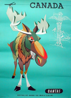
Here's some fabulous Monday inspiration in the form of 50's and 60's Qantas Travel Posters designed by William F Schey and Harry Rogers.
The full range can be seen here.
Images copyright GMJames.
Via Stickers and Stuff.
https%3A%2F%2Fwww.deliciousindustries.com%2Fqantas-travel-posters
Delicious+Industries%3A+Qantas+Travel+Posters
From the reference box #102


#102 - more vintage tins, small but perfectly formed!
The Songster Gramaphone Needles tin (top) is my favourite of this bunch. All that detailed design, illustration and typography on such a small tin - it's easy to see why they have become so desirable in recent years.
I think the Snowfire Jelly tin (middle) is from the 1940's - Snowfire Jelly was a hand cream, "for beautiful hands".
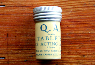
The QA Brand Tablet tin (bottom) is really, really small - only 25mm high and 12mm in diameter. QA Brand "quick acting Asprin" were produced by Thompson & Capper, a homeopathic chemist company based in Liverpool.
As always, there's lots more vintage packaging and ephemera in the reference box if you feel like a root around.
https%3A%2F%2Fwww.deliciousindustries.com%2Ffrom-the-reference-box-102
Delicious+Industries%3A+From+the+reference+box+%23102
Otl Aicher's Munich 1972 Olympic Graphics


What a lovely way to start the week - looking through a collection of Otl Aicher's, Munich 1972 Olympic graphics!
We're all familiar with the bright and colourful Munich 1972 Olympic branding, but it's rare to see so much of it in one place. This website has a huge range of items designed by Aicher and his team including memorabilia, posters, programmes, pin badges, match books, medals, publications and stationery. It really is a fantastic resource, the items above are only a small selection.
All images copyright 1972 Munich Olympics.
Via Wanken.
https%3A%2F%2Fwww.deliciousindustries.com%2Fotl-aichers-munich-1972-olympic-graphics
Delicious+Industries%3A+Otl+Aicher%26%23039%3Bs+Munich+1972+Olympic+Graphics
Welcome

Welcome to the Delicious Industries blog. We're an independent design studio based in Brighton, UK and this is our scrapbook packed full of design, illustration, photography & typography inspiration. Check out our work here.
Links
DELICIOUS FRIENDS
DELICIOUS FAVOURITES
- 50 Watts
- Acejet 170
- Grain Edit
- It's Nice That
- National Geographic Found
- Notcot
- Pretty Clever
- Retronaut
- So Much Pileup
- We Love Typography
- Another Mag


