art direction, design + typography
Blog: Design
Auto Type XXVXIII
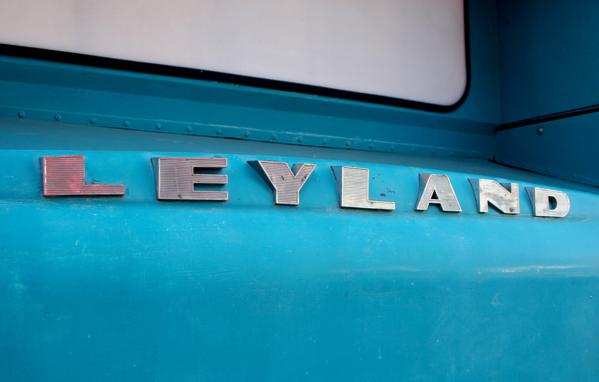
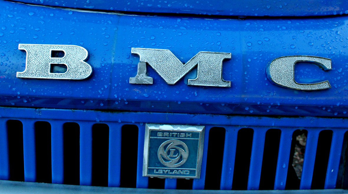
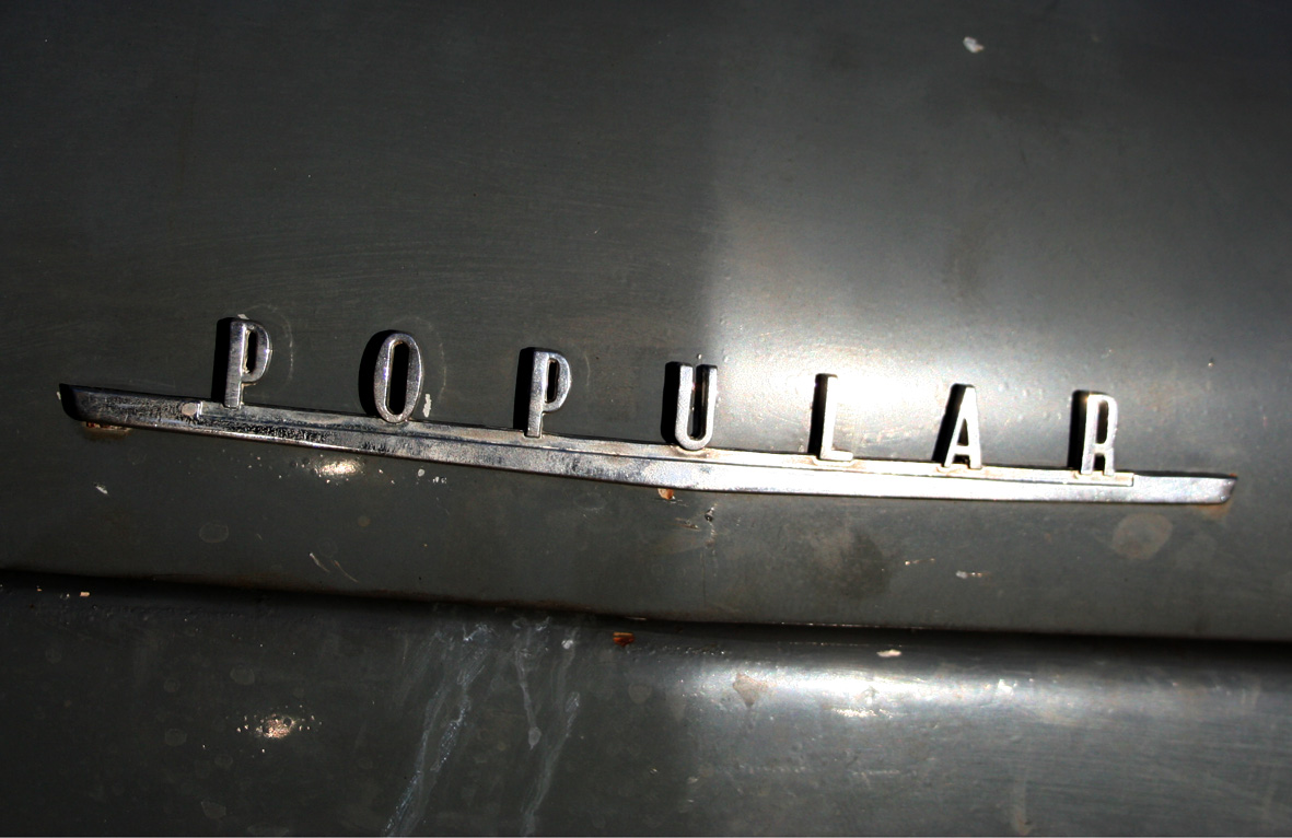
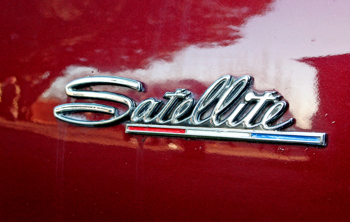
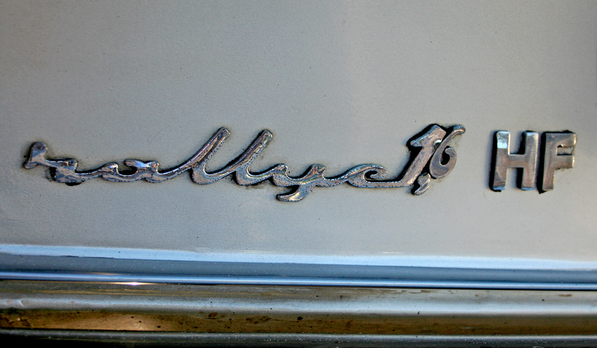
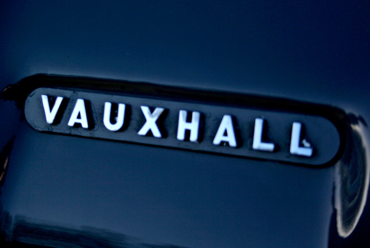
Auto Type XXVXIII - some more fabulous automobile lettering from New Years Day at Brooklands Museum. My particular favourite has to be the Leyland bus (top), not only because it reminds me of my home town, but I love how the letters are deeper at the top to work against the curved bodywork. Looks very 70s.
There's lots more of the same over in our Flickr set or here.
https%3A%2F%2Fwww.deliciousindustries.com%2Fauto-type-xxvxiii
Delicious+Industries%3A+Auto+Type+XXVXIII
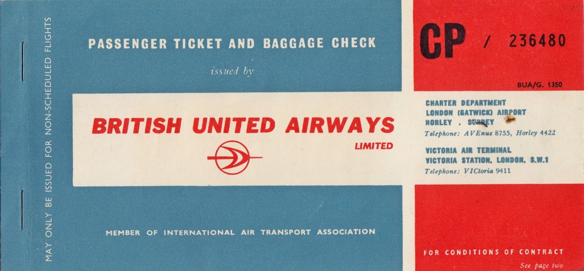
From the Reference Box #138
#138 - British United Airways passenger ticket and baggage check, 1963. I love to see a classic logo on an original bit of print so I couldn't leave this behind at the boot sale.
This lucky person, a Miss MV Dickinson travelled from London Gatwick to Venice on what was then the UK's largest independent airline, largely owned by British & Commonwealth Shipping (B&C) and the largest unsubsidised airline outside the US.
Have a delve into the rest of our reference box for more ephemera and vintage design goodies.
https%3A%2F%2Fwww.deliciousindustries.com%2Ffrom-the-reference-box-138
Delicious+Industries%3A+From+the+Reference+Box+%23138
The Lancashire Coast

As much as I love these towns though, I never remember any of them looking as lovely as Daphne illustrates them!
Image from Quad Royal.
https%3A%2F%2Fwww.deliciousindustries.com%2Fthe-lancashire-coast
Delicious+Industries%3A+The+Lancashire+Coast
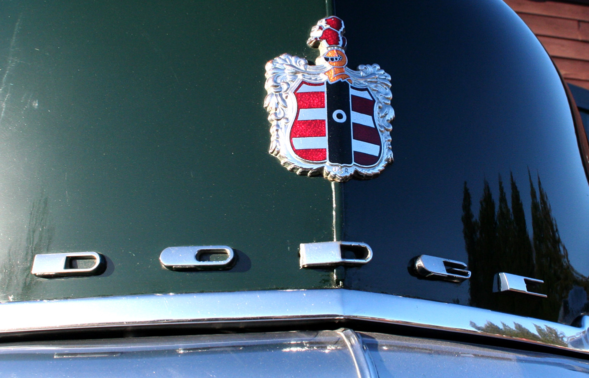
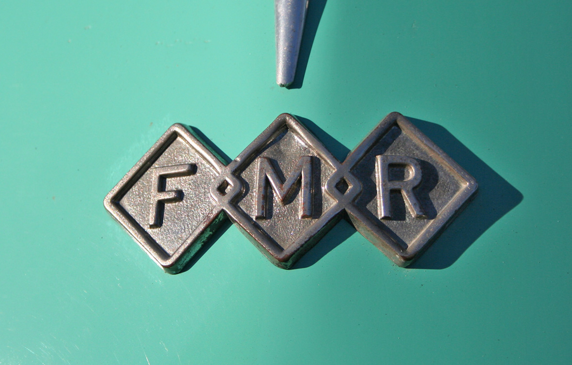
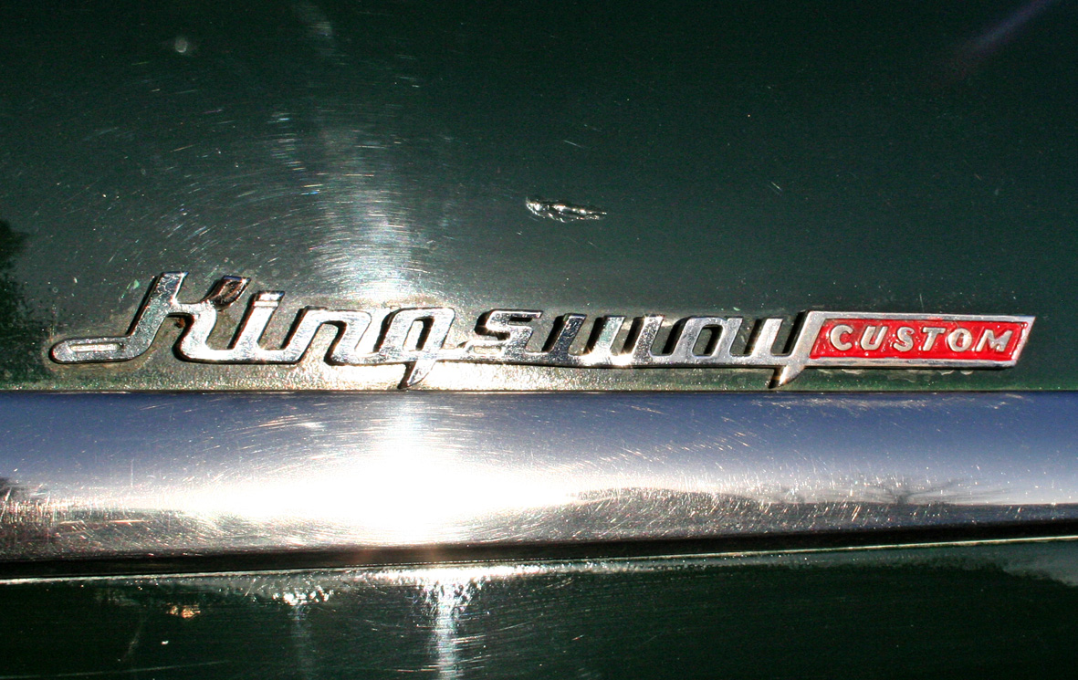
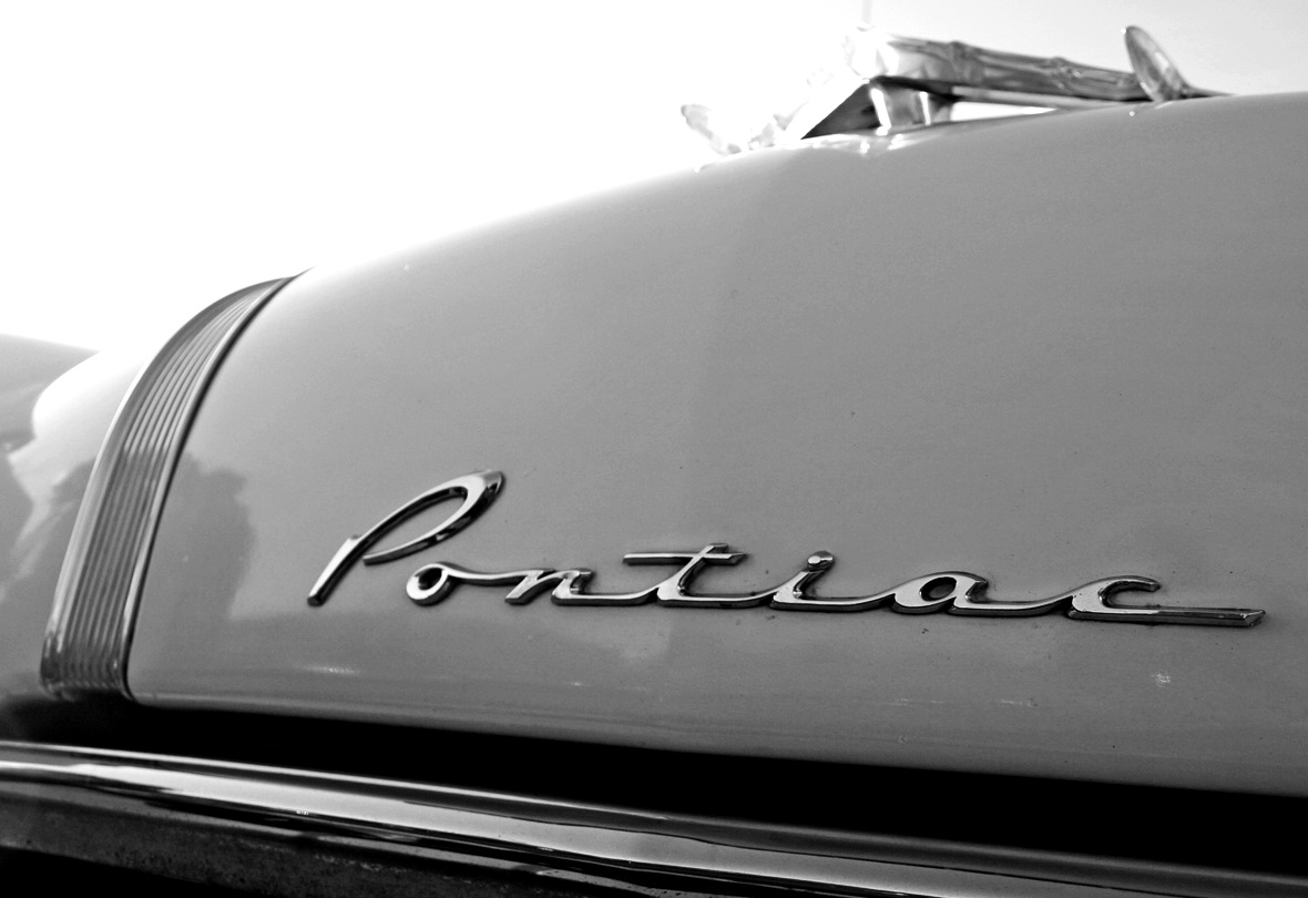
Auto Type XXVXII


Lots of weathered emblems and patina paint in this bunch but that just adds to their beauty. I particularly like the Country Squire and the Ranch Wagon - two I haven't seen before!
Check out our other Auto Type here or go to our Flickr set.
https%3A%2F%2Fwww.deliciousindustries.com%2Fauto-type-xxvxii
Delicious+Industries%3A+Auto+Type+XXVXII
From the reference box #137


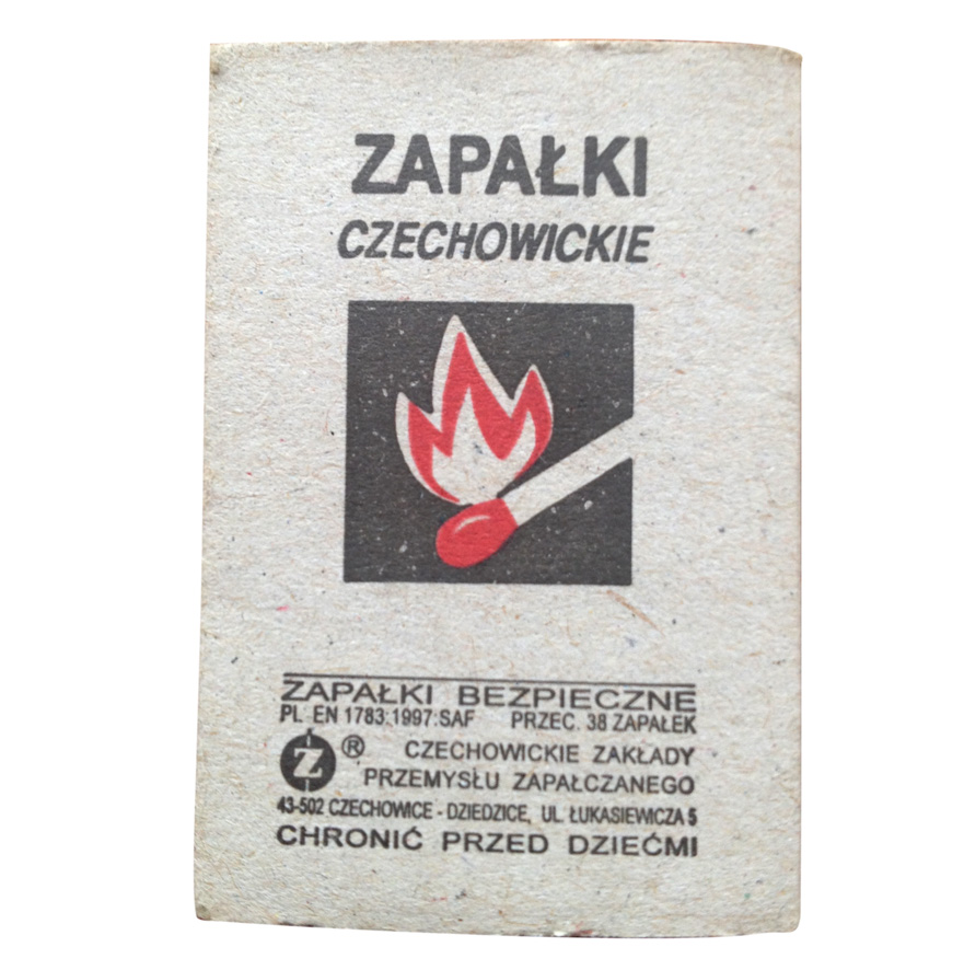
 #137 - Matchbooks & matchbook covers. This little lot were in a collection of souvenir match books I was given recently. The majority of the covers are uninspiring design-wise, but there's something about the ones above, be it their tacky charm or giant graphics that jumped out at me - especially the flame graphic!
We have many more matchbook covers in the reference box and on our blog, take a look here.
https%3A%2F%2Fwww.deliciousindustries.com%2Ffrom-the-reference-box-137
Delicious+Industries%3A+From+the+reference+box+%23137
Final weekend of AT Open House


To whet your appetite a little more, here are my favourite Petting Zoo & Collectables screen prints available at the house and also in the web shop.
https%3A%2F%2Fwww.deliciousindustries.com%2Ffinal-weekend-of-at-open-house
Delicious+Industries%3A+Final+weekend+of+AT+Open+House
Digital Bungalow Review AT Open House


The lovely folks at Digital Bungalow have written a great review of AT Open house with lots of pics for those who can't make it themselves. Read the full article here.
Images copyright Darren Baldwin at Digital Bungalow.
https%3A%2F%2Fwww.deliciousindustries.com%2Fdigital-bungalow-review-at-open-house
Delicious+Industries%3A+Digital+Bungalow+Review+AT+Open+House
Dave Thompson Sussex Prints

Our friends at Castor & Pollux have a great selection of Dave Thompson's Sussex giclee prints in stock at the moment. Based on mid-century travel posters, this nostalgic range highlights iconic buildings and landmarks in and around Sussex. These are my favourites, but check out the full range here.


All images copyright Dave Thompson.
https%3A%2F%2Fwww.deliciousindustries.com%2Fdave-thompson-sussex-prints
Delicious+Industries%3A+Dave+Thompson+Sussex+Prints
Hand-lettered linocuts for AT Open House


https%3A%2F%2Fwww.deliciousindustries.com%2Fhand-lettered-linocuts-for-at-open-house
Delicious+Industries%3A+Hand-lettered+linocuts+for+AT+Open+House
AT Open House 2013 Line-up

It's almost that time again, in less than a week AT Open house will fling open it's doors for the first Artists Open house weekend.
We'll be there with a selection of letterpress prints, cards, notebooks, totes, vintage circus prints and some new linocuts, as will AT regulars Dead Methods, Snorkus, Alice Pattullo, Petting Zoo, Mr Wingate, Hello Dodo, James Sawyer, Nathan James, Natalie Martin and Winsome & Saucy.
In addition this year, we have a new artist joining the AT gang - fabulous illustrator Claire Scully aka. The Quiet Revolution.
Claire describes her work as, "a mix of strange utopian worlds and parallel universes with juxtapositions of the unexpected, playing with scale and narrative".
I had a sneaky peek at the Giclee prints she's selling at AT open house and believe me, they look good on screen but when you see them up close and full scale, the detail in astounding.


Fret not, if you can't make it over, you can keep up-to-date on the AT blog and once the show starts all the work will be available in their online shop.
Images copyright Claire Scully.
https%3A%2F%2Fwww.deliciousindustries.com%2Fat-open-house-2013-line-up
Delicious+Industries%3A+AT+Open+House+2013+Line-up
Howdoos back in stock!


Our Etsy shop is now fully stocked with a fresh batch of Howdoos - business cards for everyone + anyone.
Hand letter-pressed onto a thick, pulpy beermat stock these personalisable business cards have 'hello' (hot pink) or 'nice to meet you' (black) on the front and 3 blank spaces on the reverse for your contact details.
https%3A%2F%2Fwww.deliciousindustries.com%2Fhowdoos-back-in-stock
Delicious+Industries%3A+Howdoos+back+in+stock%21
Sell! Sell!'s Efficacious Fentimans Ad


I think you'll agree it was well worth the effort, you can really tell the difference between this and previous ads which have been created purely digitally - this one has so much more charm and depth.

Images copyright Sell! Sell!
https%3A%2F%2Fwww.deliciousindustries.com%2Fsell-sells-efficacious-fentimans-ad
Delicious+Industries%3A+Sell%21+Sell%21%26%23039%3Bs+Efficacious+Fentimans+Ad
Printer's Pie

Printer's Pie was commissioned by Fuller's Ltd. for the newly refurbished 'Jiffy Bar' in their Ludgate Circus restaurant - right by Fleet Street in the heart of London's print-land.
The mural, "composed entirely of a giant photograph of letters chosen from nearly four hundred of the type alphabets used in modern printing and general lettercraft" includes names of UK newspapers, typefaces, type foundries and type designers. It's also thought to be the first public presentation of the Mistral typeface, designed by Roger Excoffon for the Fonderie Olive, Marseillies in 1955.
In December 1955 Printing News used Printer's Pie as the basis of a type identification competition and it was also the theme of 'Typographical Centre' exhibitions at Southgate Library and at the Bastien Studio during the 'International Typographical Year 1957'.
I have no idea if the mural still exists, but here it is in all it's glory back in 1955...

https%3A%2F%2Fwww.deliciousindustries.com%2Fprinters-pie
Delicious+Industries%3A+Printer%26%23039%3Bs+Pie
The love of imperfection


https%3A%2F%2Fwww.deliciousindustries.com%2Fthe-love-of-imperfection
Delicious+Industries%3A+The+love+of+imperfection
From the reference box #136


https%3A%2F%2Fwww.deliciousindustries.com%2Ffrom-the-reference-box-136
Delicious+Industries%3A+From+the+reference+box+%23136
Welcome

Welcome to the Delicious Industries blog. We're an independent design studio based in Brighton, UK and this is our scrapbook packed full of design, illustration, photography & typography inspiration. Check out our work here.
Links
DELICIOUS FRIENDS
DELICIOUS FAVOURITES
- 50 Watts
- Acejet 170
- Grain Edit
- It's Nice That
- National Geographic Found
- Notcot
- Pretty Clever
- Retronaut
- So Much Pileup
- We Love Typography
- Another Mag