Blog: Advertising
Congratulations Sell! Sell!

Our friends at Sell! Sell! are celebrating their blogs 1st birthday this week. It's a great resource of design/illustration and photography tip bits mixed up with some interesting thoughts on the world of advertising - here's to another successful year!
https%3A%2F%2Fwww.deliciousindustries.com%2Fcongratulations-sell-sell
Delicious+Industries%3A+Congratulations+Sell%21+Sell%21
Sellotape® Tins


I found these old Sellotape® tins at the weekend. To think Sellotape® was packaged in such an extravagant way seems crazy these days, but they are gorgeous and I love the giant 'S' on the front.
I was told they were from the 60's, but after some research I actually think they are from the mid to late 50's. These product pics (below) are from the 60's, showing the original self-adhesive tape in mostly blister-pack style packaging or sold individually from large tin tubes. There are some tins on the bottom row of the display rack, so it's my guess they were being phased out by the early 60's.

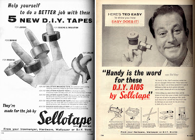
The display box (below left) is from the 60's and shows some of the new product range available from Sellotape® - Masking, Insulating and Double-sided tape, "Tapes for the Handyman". The box below right shows the more modern looking 70's packaging for the original clear tape.

The ads below ran throughout the 60's to advertise this new range of DIY tapes in DIY magazine and Practical Householder.


For more information about the history of the Sellotape® brand go here and for more info about the history of sticky tape see here.
Product display images copyright Sellotape.
https%3A%2F%2Fwww.deliciousindustries.com%2Fsellotape-tins
Delicious+Industries%3A+Sellotape%C2%AE+Tins
Smart Cookie wanted at Sell! Sell!

Our friends over at Sell! Sell! are on the lookout for a smart Account Manager/Project Manager.
We're after someone with one or two year's experience, a sharp, strategic mind, enthusiasm, attention to detail, and a love of all things creative, to work as part of our highly attractive* and hilarious* team across all of our projects and clients.
If you fancy working in a small, fast-moving, independent creative company, with the involvement, opportunity and challenges that brings, give us a shout at doubles@sellsell.co.uk
*in the eyes of our parents only
Sounds like a great opportunity for one lucky person!
https%3A%2F%2Fwww.deliciousindustries.com%2Fsmart-cookie-wanted-at-sell-sell
Delicious+Industries%3A+Smart+Cookie+wanted+at+Sell%21+Sell%21
Nesbitt's Poster

How great is this Nesbitt's poster. I had forgotten all about it until So Much Pileup posted some 70's Nesbitt's packaging. I think it's from the late 50's / early 60's judging by the print quality and design. I love the Nesbitt's logotype and just how graphic the whole thing is.
While I was trying to find out more about Nesbitt's I came across this site which has masses of memorabillia, posters and information about the company and there products:
The Nesbitt Fruit Products Company was founded in 1924 by Hugh S. Nesbitt and produced syrups to be used in soda fountains.
Nesbitt's Orange was first bottled for distribution in 1938-39, distinguished from it's competition by the fact it was made from 10% California orange juice.
Marilyn Monroe was a model for Nesbitt's Orange in 1946.
Nesbitt's Orange was the "Official Orange Drink" for Disneyland from the time it opened in 1955 into the 1960's. It was the only orange drink sold in the Park.
In 1957, the "Nesbitt's Orange Special" dragster set 1/4 Mile speed Record of 9.445 seconds (159.02 mph). It is believed that this was the first "commercially sponsored" dragster.
How cool is that?!
https%3A%2F%2Fwww.deliciousindustries.com%2Fnesbitts-poster
Delicious+Industries%3A+Nesbitt%26%23039%3Bs+Poster
From the reference box #25

“There’s a promise in a glass of Mackeson” beermat, I’m guessing from the 60’s. I really like the colours and the quality of the print, but it’s the type that stands out for me - it’s really dynamic and creates quite a modern looking layout. The unusual thing about it too is that the brand name does not appear in full on either side!
Mackeson's XXX is a dark sweet beer, known in the UK as a sweet stout or a milk stout as it is derived from milk and contains lactose and sugar.
According to Wikipedia, the Mackeson recipe has been around since 1801, long before milk stout was given a patent in 1875 and was originally brewed by Mackeson’s Brewery in Hythe, Kent, until it was purchased by Whitbread in the 1920’s.
Whitbread gave the brand the distribution and marketing it deserved turning it into the market leader for low alcohol content sweet dark beer - which seems like a very select category, but who am I to judge!
In 1950 a Mackeson tv ad showed Bernard Miles delivering one of the most long-lasting and memorable straplines of the time, informing viewers that Mackeson, “looks good, tastes good and, by golly it does you good”. Just how true that is, I’m not sure but they didn’t seem to worry too much about that back then.
These days Mackeson is owned by Whitbread, but brewed in 3 varieties by Young’s in their Ram Brewery, London ‘under supervision’ of Inbev; a 3.75% abv version for the UK, XXX version - 5% abv for the US market (brewed in Cincinnati, Ohio) and a XXX 4.9% abv version brewed by Carib Brewery, Trinidad for the local market, where it is marketed with the slogan "Take it to the Max" (at least they didn’t say - Macks!) to fitness conscious young men that enjoy socializing - still on the “it does you good” theme it seems.
Who would have guessed - all that from one tiny beermat!
#25 - Mackeson Beermat
https%3A%2F%2Fwww.deliciousindustries.com%2Ffrom-the-reference-box-25
Delicious+Industries%3A+From+the+reference+box+%2325
Advertising Greatness

I'm loving the series of Advertising Greatness over on the Sell Sell blog - this week it's the David and Goliath story of Avis, the car rental company and last week it was all about the adorable Nauga. Looking forward to the next one already!
https%3A%2F%2Fwww.deliciousindustries.com%2Fadvertising-greatness
Delicious+Industries%3A+Advertising+Greatness
The Nauga

How gorgeous is this Nauga? An advertising mascot created to advertise Uniroyals' synthetic fabric, 'Naugahyde' in the 60's and make it stand out from the competition.
You can read the full story here - any of you US peeps got one? Apparently they can still be found.
Via Sell! Sell!
https%3A%2F%2Fwww.deliciousindustries.com%2Fthe-nauga
Delicious+Industries%3A+The+Nauga
San Francisco Zoo - Critter Quest


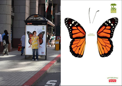
I love these new ads for San Francisco Zoo by BBDO West also in SF. It is such a simple, fun idea - interactive ads in their most basic form!
The campaign is designed to 'get people connected' with the zoo, and the idea is for people to stand in front of the bus shelter posters, get someone to take their pic and then upload it to the website gallery for a chance to have your pic used on a print ad for the zoo. The campaign was only launched at the start of the month and there are already thousands of very funny pics in the gallery...

Definitely one of those ideas that I wish was mine!
Images from Coloribus.
https%3A%2F%2Fwww.deliciousindustries.com%2Fsan-francisco-zoo-critter-quest
Delicious+Industries%3A+San+Francisco+Zoo+-+Critter+Quest
From the reference box #18

This is a Gleem Toothpaste sample pack from the 50's. I didn't know much about Gleem when I bought it, I just like the print and the overlapping to get the brown/dark red colour - very simple, but effective.
I have since found out (through the fountain of knowledge that is Wikipedia) that Gleem was made by Procter & Gamble and was first introduced in 1952 (in the packaging above). 'Compton Advertising Inc.' (now part of Saatchi & Saatchi NY) co-ordinated the advertising for the first Gleem campaign (Ads 1 + 2 below) which was included in the 'League Against Obnoxious TV Commercials' list of 'terrible 10' in May 1963. Needless to say by 1969 the brand was flagging, so the advertising account was moved to 'Wells, Rich, Greene' (Ad 3 below) where it remained until 1976 when it was transferred to 'Leo Burnett', Chicago (Ad 4 below).

As far as I am aware Gleem is still available from some stores in the US, but it never seemed to really hold a big share of the toothpaste market, which is a shame because it packaging at least was great. Below is another sample pack found on Flickr (I think from the 60's) along with the packaging as it stands today.

#18 - 1950's Gleem toothpaste sample pack
https%3A%2F%2Fwww.deliciousindustries.com%2Ffrom-the-reference-box-18
Delicious+Industries%3A+From+the+reference+box+%2318
From the reference box #17


The Practical Householder, January 1961. This is great publication, packed full of adverts, and I mean packed full - the first article starts on page 25, before that it is just pages of mainly mono ads selling anything from sheds to chandeliers.
There is a 'test report' for a fast-boiling kettle - 'the latest edition to the housewife's time-saving equipment', a heat controlled iron and a multi-purpose tool for house and garden.
The illustrations, typography and graphics are fantastic reference, but the best things about this magazine are the many 'DIY/How to' pages. In this issue alone there are instructions on 'how to make'; a table for occasions (see above), a perspex fruit trough, a veneered light (see above), pelmets & curtains, a stow-away top for table tennis, a fold-away linen bin, a selection of children's wooden toys, a storm door, a cocktail bar, a wrought iron balustrade, lattice steps 'for the housewife', a birdcage suspension bar and a nursery chair. As well as how to re-cover a three-piece suite, prevent condensation, hide a waterpipe and hang a kitchen cupboard!
Did a 1960's man really have enough spare time in a month to make all those things? If so. where did all the time go, I don't think I have time to make even one of those things in a month - or is it a case of the women doing so much that the men really didn't have anything to do except play at DIY?
So quite a packed #17 - The Practical Householder, January 1961
https%3A%2F%2Fwww.deliciousindustries.com%2Ffrom-the-reference-box-17
Delicious+Industries%3A+From+the+reference+box+%2317
From the reference box #7

You've got to love this - advertising in it's simplest form. Some kids in the local area started a car washing business last Summer and popped these on all the cars.
Exhibit #7 - Hand written car wash flyer
https%3A%2F%2Fwww.deliciousindustries.com%2Ffrom-the-reference-box-7
Delicious+Industries%3A+From+the+reference+box+%237
Sell! Sell! need YOU

Our friends at Sell! Sell! are on the lookout for a full-time, junior designer. We've worked with them on quite a few projects now and it's always fun - although you may want to brush up on your Wii skills!
Interested parties should email doubles@sellsell.co.uk with current work or visit their blog for more info.
https%3A%2F%2Fwww.deliciousindustries.com%2Fsell-sell-need-you
Delicious+Industries%3A+Sell%21+Sell%21+need+YOU
Goodbye to Paul Arden

We would like to pay tribute to Paul Arden, who died yesterday after a long illness. He was a Executive Creative Director of Saatchi & Saatchi for many years creating great campaigns such as British Airways and Silk Cut. In recent years he became a published author, with top selling books, 'It’s Not How Good You Are, It’s How Good You Want To Be', 'Whatever You Think, Think The Opposite' and, last year, 'God Explained In A Taxi Ride'.
He also ran one of our favourite galleries, Arden & Anstruther, a New York-style Photography Gallery in Petworth along with his wife, Toni.
Our thoughts and deepest sympathies go out to his family and friends. Messages of condolence can be left on the Creative Review Blog.
https%3A%2F%2Fwww.deliciousindustries.com%2Fgoodbye-to-paul-arden
Delicious+Industries%3A+Goodbye+to+Paul+Arden
Welcome

Welcome to the Delicious Industries blog. We're an independent design studio based in Brighton, UK and this is our scrapbook packed full of design, illustration, photography & typography inspiration. Check out our work here.
Links
DELICIOUS FRIENDS
DELICIOUS FAVOURITES
- 50 Watts
- Acejet 170
- Grain Edit
- It's Nice That
- National Geographic Found
- Notcot
- Pretty Clever
- Retronaut
- So Much Pileup
- We Love Typography
- Another Mag

