From the reference box #136
https%3A%2F%2Fwww.deliciousindustries.com%2Ffrom-the-reference-box-136
Delicious+Industries%3A+From+the+reference+box+%23136
Auto Type XXVX
Auto Type XXVX - some lovely American lettering to get us through the rest of the week. The C-750 Big Job Ford was the hands down the biggest auto type I've ever seen!
If Auto type is your thing, check out the rest of our collection here and here.
https%3A%2F%2Fwww.deliciousindustries.com%2Fauto-type-xxvx
Delicious+Industries%3A+Auto+Type+XXVX
Daphne Padden Tea Towels
The wonderful Daphne Padden collages discovered and reproduced as screen prints by Quad Royal (read about them here) are now available as fabulous tea towels over on ToDryFor. Problem is, they're almost too gorgeous to dry dishes with!
https%3A%2F%2Fwww.deliciousindustries.com%2Fdaphne-padden-tea-towels
Delicious+Industries%3A+Daphne+Padden+Tea+Towels
Bob Gill & Print Club
The exhibition will showcase 6 new silk screen prints in editions of 15. Each one has been lovingly hand coloured by Bob with watercolour in the Print Club studio making them all unique.
It opens with a preview on Friday 28th and runs until 11 April at the Print Club Gallery, 10-28 Millers Avenue, Dalston E8 2DS.
Image copyright Bob Gill.
https%3A%2F%2Fwww.deliciousindustries.com%2Fbob-gill-print-club
Delicious+Industries%3A+Bob+Gill+%26amp%3B+Print+Club
Gilbert Garcin
Gilbert Garcin is one of my favourite photographers. At the age of 65, when most people are thinking of retirement, Garcin gave up his lamp manufacturing business in Marseille and became a photographer.
Garcin's images are self portraits featuring himself, usually in a grey overcoat to represent the everyman and sometimes his wife. They're beautifully graphic, surreal and a little crazy - I love them!
You can find out more about Gilbert Garcin and view his full portfolio of work here.
Images copyright Gilbert Garcin.
https%3A%2F%2Fwww.deliciousindustries.com%2Fgilbert-garcin
Delicious+Industries%3A+Gilbert+Garcin
Vintage Poster Resource
I stumbled across Free Vintage Posters today and what a great resource it is. Packed full of, well you guessed it - vintage posters!
They're not 'free' to use, only to download as they don't own the copyrights to the posters or the images but none-the-less I think it's worth a bookmark. Enjoy...
Via Notcot.
https%3A%2F%2Fwww.deliciousindustries.com%2Fvintage-poster-resource
Delicious+Industries%3A+Vintage+Poster+Resource
World Book Day
First published in 1956, it follows the life of a young Durrell when he & his family moved to Corfu (1934 - 39) - something he describes as, "like living in one of the more flamboyant and slapstick comic operas".
Packed with anecdotes of his eccentric family, his pets, the wildlife on the island and the characters he encounters along the way, it starts with a wonderful quote:
"There is a pleasure sure
In being mad, which none but madmen know."
DRYDEN, The Spanish Friar, II, i
https%3A%2F%2Fwww.deliciousindustries.com%2Fworld-book-day
Delicious+Industries%3A+World+Book+Day
Eyebombing
Eyebombing, Humanizing the world, one googly eye at a time - what could be more fun?!
Googly eyes on inanimate objects always amuses me, it reminds me of wet camping holidays as a child. My sisters and I used to glue googly eyes onto shells to make little creatures - the hours used to fly by!
The idea of Eyebombing was created by 2 danes. It's "the act of setting googly eyes on inanimate things in the public space. Ultimately the goal is to humanize the streets, and bring sunshine to people passing by".
The Rules
1. Only images of inanimate objects with wiggle eyes - NOT stickers.
2. Only images taken in the public space.
1. Only images of inanimate objects with wiggle eyes - NOT stickers.
2. Only images taken in the public space.
So order your starter pack and away you go...
Images from Eyebombing. Copyright of the individual photographers.
https%3A%2F%2Fwww.deliciousindustries.com%2Feyebombing
Delicious+Industries%3A+Eyebombing
Auto Type XXVIX

Auto Type XXVIX - we had a wonderful morning at yesterday's Goodwood Breakfast Club. It was the first of the year and the Pre-73 theme meant a vast turn out of quality motors from hotrods to historic racers - here are some of our favourite auto types.
You can see more of our Breakfast Club pics over on Super Ninety and view our full collection of Auto Type here and here.
https%3A%2F%2Fwww.deliciousindustries.com%2Fauto-type-xxvix
Delicious+Industries%3A+Auto+Type+XXVIX
Work, work, work…
It's been a while since we posted some of our actual work (yep, we do have to do some of that), so above are a few identities we've created over the last few months; Propelia - a Navigation Agency for Audacious Thought Leaders (top), GGT - Green Gas Trading (middle), ADBA - The Anaerobic Digestion & Biogas Association (bottom).
Check out more of our Delicious work here.
https%3A%2F%2Fwww.deliciousindustries.com%2Fwork-work-work
Delicious+Industries%3A+Work%2C+work%2C+work%26%238230%3B
Horse Meat Not Rationed!
Image via Retronaut.
https%3A%2F%2Fwww.deliciousindustries.com%2Fhorse-meat-not-rationed
Delicious+Industries%3A+Horse+Meat+Not+Rationed%21
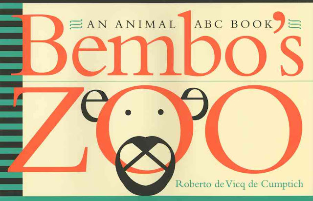
Bembo's Zoo
I just saw this lovely little ABC book over on Brain Pickings. It was designed by Roberto de Vicq de Cumptich and published in 2000 so it's been around a while but it's typographic illustrations have definitely stood the test of time.
Roberto wanted an ABC book he could use to teach his daughter both English and Portugese so it needed animal names that started with the same letter in each language. After an unsuccessful search he created his own version, Bembo's Zoo using the typeface Bembo as a basis for all the typographic illustrations...
You can see more of Roberto's beautiful typography here.
All images and illustrations copyright of Roberti de Vicq de Cumptich
https%3A%2F%2Fwww.deliciousindustries.com%2Fbembos-zoo
Delicious+Industries%3A+Bembo%26%23039%3Bs+Zoo
Who made the Pantone chip?
“God created the world in seven days, and on the eighth day, he called Pantone to put color into it.” Lawrence Herbert
Many of us use the Pantone colour system pretty much everyday, but do any of you know it's origins - who created it, how and why?
No? Neither did I until today when I read this great little article in The NY Times.
Via the lovely @MaraidDesign on Twitter.
https%3A%2F%2Fwww.deliciousindustries.com%2Fwho-made-the-pantone-chip
Delicious+Industries%3A+Who+made+the+Pantone+chip%3F
From the reference box #135
#135 - The County of London Plan, published by Penguin Books in 1945. This lovely little booklet is packed full of beautifully graphic maps (which I'll do a separate post about) showing the County of London and the surrounding London areas.
It covers current and proposed land use residential and commercial (this was immediately after the war and much of the city needed re-development), looks at traffic & public transport solutions, population density problems and shows plans for the Thames riverside re-development. All of which are illustrated with these wonderful infographics...
The booklet credits the British Council for use of the illustrations, so I'm afraid the artist is unknown.
For more delightful ephemera have a dig around the rest of our reference box here.
https%3A%2F%2Fwww.deliciousindustries.com%2Ffrom-the-reference-box-135
Delicious+Industries%3A+From+the+reference+box+%23135
Poster Art 150: London Underground's Greatest Designs
Metropolitan Railway, unknown artist, 1886
Constancy, Julius Klinger, 1929 & By Underground to fresh air, Maxwell Ashby Armfield, 1915
Epping - Central line extension, K G Chapman, 1949 & Winter sales, Edward McKnight Kauffer, 1921
To summer sales by Underground, Horace Taylor, 1926 & London Zoo, Abram Games, 1976
Cycle and Motor Cycle Show, Charles Burton, 1930
Brightest London is best reached by Underground, Horace Taylor, 1924 & Avoid the wet - travel Underground, Kathleen Stenning, 1925
London Underground is continuing it's 150 year anniversary celebrations with Poster Art 150: London Underground's Greatest Designs - an exhibition showcasing 150 of the greatest ever Underground posters selected from their collection of over 3300 posters.The last major exhibition of these posters was way back in 1963 to celebrate it's centenary so it really will be worth a look. Alongside letterpress posters from the late nineteenth century, there will be designs from Edward McKnight Kauffer, Paul Nash and Man Ray.
The exhibition runs until October 2013 so there's plenty of time to see it. But if you can't get over there don't worry, the exhibition sponsors, Siemens are running an online vote for your favourite poster so you can see them all (and vote for them) here.
All images copyright London Transport Museum.
https%3A%2F%2Fwww.deliciousindustries.com%2Fposter-art-150-london-undergrounds-greatest-designs
Delicious+Industries%3A+Poster+Art+150%3A+London+Underground%26%23039%3Bs+Greatest+Designs
Welcome

Welcome to the Delicious Industries blog. We're an independent design studio based in Brighton, UK and this is our scrapbook packed full of design, illustration, photography & typography inspiration. Check out our work here.
Links
DELICIOUS FRIENDS
DELICIOUS FAVOURITES
- 50 Watts
- Acejet 170
- Grain Edit
- It's Nice That
- National Geographic Found
- Notcot
- Pretty Clever
- Retronaut
- So Much Pileup
- We Love Typography
- Another Mag


